Showing posts with label mapping. Show all posts

Wednesday

Data mapping singles

Just in time for Valentine's Day, the Trulia trends blog on the website trulia.com (slogan: real estate data for the rest of us) has mapped men and women living alone in US metropolitan areas including New York, LA, San Francisco, Chicago, and Washington DC. In case you can't read the maps or don't know the cities well enough, the data are also available by website. Some insights:
What do these neighborhoods have in common? Billy Joel was right: in most metros, the neighborhood with the highest ratio of men to women is in or near downtown, as well as in recently redeveloped neighborhoods like Boston’s Waterfront or Long Island City. Even man-rich Rosslyn is a major employment center despite being in northern Virginia, outside of Washington D.C.
The neighborhoods with the highest ratio of women to men tend to be more residential, like San Francisco’s Marina and Seattle’s Queen Anne, and more upscale (and safe), like the Upper East Side and Upper Connecticut Avenue. Some are near major retail centers, like Chicago’s Near North Side, the Beverly Center in LA, and Atlanta’s Perimeter Mall, though Houston’s Great Uptown neighborhood — which skews toward men — is near the Galleria, Texas’s largest mall.
A couple of notes: there's a brief and clear data explanation at the end of the post. And these are maps of straight men and women; the blog has a related post, "Welcome to the Gayborhood" equally useful though sadly without rainbow-colored maps.

Friday

Tracking NYC's snowplows

Here's a new site to play with during the storm: New York City's new snowplow tracker, PlowNYC.
You get to plug in an address and see how recently the street in front of it has been plowed. (It's updated every 30 minutes.) Handy pop-ups tells you whether your street is a primary, secondary, or tertiary street.

And while we're at it, Gothamist has provided a handy borough-by-borough list of the best places for sledding. Stay warm!

Update, February 11: I had hoped to update the post with a link to Boston's snowplow tracker, but the site got so much traffic during the storm that it has been shut down. Story here. And here is a good set of photos of the storm posted by TheAtlantic. Screenshot of one, below.


Maps can explain the world

Or at least some of it. That's a screenshot of one of the very cool maps Business Insider has put together here. Do they explain the entire world? Not really. Are there things that could be done better? Yes, and feel free to identify them in the comments. Enjoy the link, and the weekend.

Monday

Analyzing tweets in real time


The computer giant SGI has teamed up with scientists at the University of Illinois to create the Twitter Global Heartbeat, a "real-time combined population, tone and geographic analysis and heat map visualization of Tweets." That is, the Twitter Global Heartbeat analyzes 10% of Twitter's 500 million daily tweets as they are posted and analyzes the content, tone, and location. The project converts the data to a map, showing hot spots of positive and negative comments. The video above is an analysis of tweets as Hurricane Sandy approached the US coast and moved inland. (I found it thanks to Robert Wright's post in TheAtlantic.com)

It's a new service (my choice of videos was Sandy or the US Presidential election). There are also some snapshots and graphs. Here's an example of the former, picturing "Global Sentiment from Live Twitter Feed." (Red is negative, blue is positive.)

The snapshot is November 15 - I can see why the Mideast is such a hotspot of unhappiness, but what was happening in Indonesia then? If you know, let us know in the comments.

You can follow the Twitter Global Hotspot's twitter feed here.

Wednesday

Very cool, and thoughtful, mapping web site.

I came across this very creative mapping site yesterday. Benjamin Hennig, the owner, a cartographer at the University of Sheffield, is interested in improving how mapmakers can use maps to better convey information. He's particularly interested in visualizing social dimensions. The map above? It's a screenshot of a 2010 map showing maps participating in the 2010 World Cup tournament (in white; past winners of the world cup are starred) with all countries sized according to GDP.

The site has other interesting maps, including Foreign Debt Holders of US Government Securities (2011), a visualization of population changes in Sheffield (2012), and a map of Global Publishing Markets (2012). There's also a post comparing Hennig's method to conventional mapping approaches, around the issue of refugees, here. In addition to the fact that the maps are interesting, and information pops out at you, each post contains a careful explanation of and referral to relevant data sources. It's a great site, and I intend to continue exploring it. You should, too, but first click on the map below.

Tuesday

The Trust for America's Health has published a new report called "F as in Fat: How Obesity Threatens America's Future 2012." Brian Fung of the Atlantic writes that according to the report, at present rates, at least half of Americans in 39 states will be obese. The map above? That's a projection, based on present rates, showing which states will have an obese population of 50% or morein 2030. Because trends might change, here's a somewhat less depressing map showing 2011 obesity rates (from the Trust for America's Health):


The Trust for America's Health has an interactive map that allows you to compare obesity rates in 2030 if BMI is reduced 5%, and obesity rates in 2030 if there's no change. And you can get the full report here.

What's the consequence? The Trust for America's Health states that if we can succeed in reducing adult obesity, we will lower disease rates and health care costs:
If BMIs were lowered, the number of Americans who could be spared from developing major obesity-related diseases could range from:
  • Type 2 diabetes: 14,389 in Alaska to 796,430 in California;
  • Coronary heart disease and stroke: 11,889 in Alaska to 656,970 in California;
  • Hypertension: 10,826 in Alaska to 698,431 in California;
  • Arthritis: 6,858 in Wyoming to 387,850 in California; and
  • Obesity-related cancer: 809 in Alaska to 52,769 in California.
And nearly every state could save between 6.5 percent and 7.9 percent in health care costs. This could equate to savings ranging from $81.7 billion in California to $1.1 billion in Wyoming. Florida, the only state that would save less than 6.5 percent in health care costs, could save 2.1 percent or $34 billion.
It's, well, food for thought.

Friday

Story Maps and more from ESRI

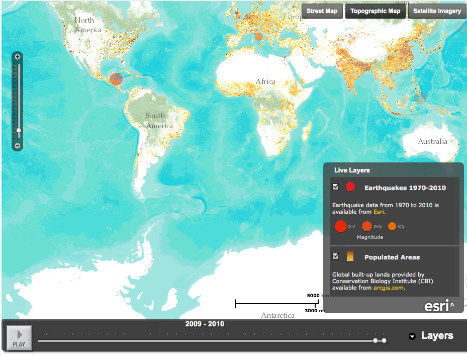
ESRI is a California-based company that encourages companies and not-for-profits to use geographic information software - mapping - to analyze, interpret and understand data. The company also provides extensive maps showing earthquakes, eruptions, and weather events, as part of its disaster response program. Here's a screenshot, for example, of its earthquake timeline map, showing 2009-2010. Note the background of populated areas; by layering the earthquake data on top the map tells you a lot of information quickly.
(Since this is a screenshot it won't play; click here for the ESRI map.)

Telling a story with maps is something ESRI actively encourages - and teaches people how to do on its web site. Here, for example, is an app that lets users follow the Olympic torch relay through the UK. You choose a day, you choose a town and you get a map and a flicker stream of pictures of the torch relay from that day. The site also has an explanation of story maps, templates, and (in pdf) a step-by-step guide to developing a story map.

It's a very clear, well thought through website - I learned about it from James Fallows' blog, where he posted an ESRI map overlaying the storm strength in DC and Maryland this week on top of "social vulnerability" detail, ie, data showing where elderly or low-income people might be. These (there is a regional map, along with detailed maps of Baltimore and Washington) are the featured maps on the ESRI site.

Wednesday

A useful map from the NY Times

Update, March 7: Here's a link to Mayor Bloomberg's press conference and press release announcing the results of the first 18 months of grades: the percent of restaurants with A grades has increased to 72%. The incidence of salmonella in the city has decreased. Most of the key violations declined. You can get DOHMH's full report here as a pdf. Here's a screenshot of the trends reported salmonella graph:

Source: NYC DOHMH 
The focus on outcomes is refreshing and very useful. 

The NY Times has mapped New York City's restaurants, coding them according to their NYC Department of Health (and Mental Hygiene, to give its full title) cleanliness rating system. Here's a screenshot of our local restaurant row:


The blue dots are A grades; the green dots are B grades. When you roll your mouse over the dot, you get the restaurant's name grade, and the number of violations; you can click on the map and get details (perhaps more than you want). You can filter by grade, type of violation (vermin, insects, personal cleanliness, chemicals, or food temperature) and by type of cuisine. And, like any map, you can zoom. My only complaint is that once you have a location, you can't move by clicking on the edges of the map, you have to type a new location into the app. It's a great service - I wouldn't pick a restaurant using only this information, but it's a great way of presenting it.

Popular Posts