
Thursday
Hunger and malnutrition data from the Guardian
The chart, which is here courtesy of the Guardian, is part of an interesting column about the UN's new indicators about food and hunger worldwide. The Guardian calls it a suite of indicators, and that's a useful term: when one number isn't enough to describe a phenomenon it's useful to use several, so that you pick up on many aspects. The Guardian's column, for example, also describes the change in the distribution of hunger and malnutrition over the past 10 years, and the general impact of food insecurity. There's also a chart displaying data on the "double burden" of malnutrition - child stunting and adult obesity. The Guardian also provides links to the full data set.
Wednesday
Soda consumption in one graph

Now that New York City's regulations on the sale of large sodas are close to coming into effect, here's a graph showing an interesting convergence: coffee sales and soda sales are coming close, it lease in terms of revenue. (Note that it doesn't show anything about amounts consumed.) It's from Derek Thompson of The Atlantic. He goes on to point out that part of the explanation is that coffee costs more, but another is that we really are starting to substitute water or sports drinks for soda. Read the column - it's a good one. And let me know if you find consumption data anywhere.
Tuesday
Walking more - and measuring it
Here's a new, smaller entry in my self-quantifiers series. Alexis Madrigal, in The Atlantic, has posted a column about his new fitness program: walking. Yes, walking, that famous 10,000 steps per day to fitness, or at least health. According to Madrigal, that's about double the American number of just over 5000 steps per day.
So, how much do you have to walk every day to get up to those 10,000 steps? Ten thousand steps is about five miles (the distance varies with your height and the length of your stride). You don't have to set out to walk five miles to get that number of steps in. But you do have to make an effort to walk places that you might otherwise drive to. In New York City, that's not a problem, but in other places, where there are no sidewalks, it can be.
Madrigal puts it like this:
I'll give him the last word: "when you have the opportunity to walk as a means to an end, take it."Americans lag behind the rest of the world in steps taken precisely because we travel so rarely for transportation's sake. Our cities are spread out (NYC excepted) and car culture is everywhere. A Centers for Disease Control study found that almost 40 percent of Americans had not walked for 10 straight minutes in the past week!Even more interestingly, Gregg Furie of Yale Medical School led a study that showed that less than 25 percent or people walked or biked as a means to get from one place to another for more than 10 straight minutes in a given week. And yet, Furie's study found that people who engaged in "active transportation," as he calls it, had lower BMI, smaller waists, and lower odds of hypertension and diabetes.
Monday
Worldometers - one cool web site

The image is a screenshot from a website called Live Statistics in the USA. It's related to Worldometers, which provides real time world statistics. There's a screenshot of it, below. Sometimes its fascinating to watch the number of babies born today click up. But there's more to the site than that. There's data transparency. Wondering about that figure of 931 US homicides this year (as of January 22)? If you click on the "Info" button you get this:
The CDC link takes you to CDC's Faststats page. As with anything else, you need to do a little thinking: the figure of 931 is a calculation based on the CDC's rate of 5.3 homicides per 100,000 population, 21 or so days into the year.[R]ates per 100,000 people are decreasing steadily since 1991, and are now back at the levels of the mid 1960's after being at twice the current rate in the 70's and 80's. Current estimates are based on CDC data.
Here's a screenshot from Worldometers:

Thursday
Yup, it's cold. Here's an explanation

Climate Central's Andrew Freedman quotes Michelle L'Heureux, a climate scientist at NOAA, on the Madden Julian Osciallation:
“The MJO is presently located in a position that favors increased tropical rainfall over the central Pacific (and decreased rainfall over the eastern Indian Ocean-Maritime Continent),” L’Heureux said in an email conversation. “This pattern is most significantly linked to more cold air outbreaks over the eastern U.S.”She added that it may be too early for the sudden stratospheric warming event's effects to be felt - which means more cold weather ahead. You can read more about the "sudden stratospheric warming event" here. And yes, it's climate change related. According to Climate Central, sudden stratospheric warming events take place in about half of Northern Hemisphere winters, and they have been increasing in frequency.
Image via http://www.intellicast.com/National/Temperature/Current.aspx
Wednesday
Causation and correlation again
A recurring theme in this blog is that correlation is not causation. Yet it's easy, and tempting, to make the mental leap from correlation to causation without sufficient information. Today's example is this column from Lindsay Abrams in The Atlantic. Titled "When Trees Die, People Die" the column describes a study that appears in the American Journal of Preventive Medicine about the relationship between trees and human health.
Here's how Abrams describes the study:
It's the kind of thought-provoking study that should inspire more studies. Let's hope it does.
Here's how Abrams describes the study:
Within four years of first becoming infested, the ash trees die -- over 100 million since the plague began. In some cases, their death has an immediate impact, as they fall on cars, houses, and people. In the long term, their disappearance means parks and neighborhoods, once tree-lined, are now bare.
Something else, less readily apparent, may have happened as well. When the U.S. Forest Service looked at mortality rates in counties affected by the emerald ash borer, they found increased mortality rates. Specifically, more people were dying of cardiovascular and lower respiratory tract illness -- the first and third most common causes of death in the U.S. As the infestation took over in each of these places, the connection to poor health strengthened.Note the use of the word "may" in the first sentence of the second paragraph, and the conclusion in the last sentence. But the post overstates the conclusions of the study, which is available here. The authors, having surveyed the literature, conclude that their study strengthens the correlation, but reiterate that they can conclude nothing about causation.
It's the kind of thought-provoking study that should inspire more studies. Let's hope it does.
Tuesday
"The Half-Life of Facts," by Samuel Arbesman
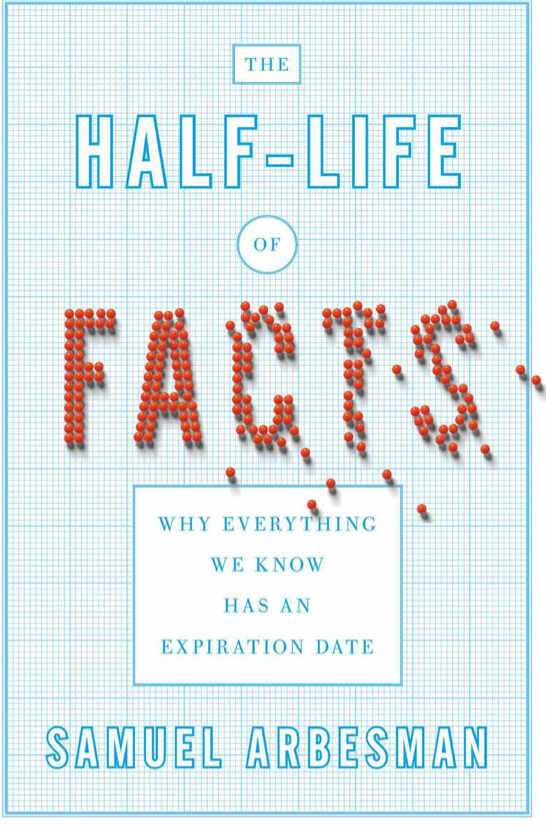
In his clear and well-written book Arbesman tells us how to approach the problem. He demonstrates how knowledge changes in regular ways, ways that are systematic enough for us to understand. He argues that understanding the changes helps us make sense of the world and allows us to prepare for the changes we can anticipate. (I think these are what have been called in another context the known unknowns.) From my blog's perspective, it's a well-written, useful book about the importance of thinking critically.
Arbesman uses the work of John Ioannidis to remind us that one study is never enough, and that we are prone to jumping to conclusions. Just because something has been published doesn't mean that it is true, or will hold up over time. In fact, chances are, it won't. (As in most other statistical situations, that means the aggregate of papers, because you can't at any particular time tell which ones will last.) Replication is the best way to test scientific findings, but replicating someone else's work doesn't mean prizes or even necessarily publication. Here are a few common-sense corollaries that Arbesman provides to keep in mind when you read or hear about new studies:
- The smaller the studies conducted in a scientific field, the less likely the research findings are to be true.
- The smaller the effect sizes in a scientific field, the less likely the research findings are to be true.
- The greater the number and the lesser the selection of tested relationships in a scientific field, the less likely the research findings are to be true.
- The greater the flexibility in designs, definitions, outcomes, and analytical modes in a scientific field, the less likely the research findings are to be true.
- The greater the financial and other interests and prejudices in a scientific field, the less likely the research findings are to be true.
- The hotter a scientific field (with more scientific teams involved) the less likely the research findings are to be true.
There's a lot more going on in this entertaining and interesting book. If you think, as I did, that the title is a metaphor, well, nope. Growth in human knowledge is exponential, though different fields have different rates of increase. New discoveries prove old ones wrong, and what we know changes. There are a couple of concomitants to this information. First, it's getting harder to make discoveries (though contiguity with one's collaborators makes everyone's work better.) Second, over time, most scientific papers will be superseded or shown to be wrong. The turnover is true for central tenets as well as for details.
You may have heard of Moore's Law, the one that says that the capacity of a computer chip doubles every 12-18 months. In a chapter titled "Moore's Law of Everything" Arbesman generalizes that tenet to growth in many areas. The interplay between science (what we know) and technology (what we can do) depends on the growth of knowledge. But it also depends on the growth of the human population: more population means more knowledge. Of course, he adds, the people need to be interested in and able to become scientists and engineers, and we need to be able to communicate what we have learned. Sometimes knowledge in one field stays hidden from experts in another, but we are beginning to understand the mechanisms that allow the systematic exploitation of one area's learning in another. We often study what interests us, what we like, or what’s easier to discover. And cognitive biases can interfere with our ability to understand what is right under our noses.
This is not a book of philosophy or statistics but a very good effort at making some useful work accessible. Do you agree? Let me know what you think in the comments.
Monday
Global warming - 62 years in 13 seconds
You’ll note an acceleration of the temperature trend in the late 1970s as greenhouse gas emissions from energy production increased worldwide and clean air laws reduced emissions of pollutants that had a cooling effect on the climate, and thus were masking some of the global warming signal.
Friday
American views on gun control - shifting at last?

The New York Times reports today that a recent Times/CBS News poll appears to show that Americans have - at last! - begun to agree that gun laws need tightening:
[T]he poll found that a majority of Americans — 54 percent — think gun control laws should be tightened, up markedly from a CBS News poll last April that found that only 39 percent backed stricter laws.
It gets better: support for background checks at all gun sales (including those by unlicensed sellers_ and a ban on high-capacity magazines is increasing.The rise in support for stricter gun laws stretched across political lines, including an 18-point increase among Republicans. A majority of independents now back stricter gun laws.
But since this is a blog about data use, what's wrong with the chart? Two things - it doesn't say when the reporting period starts, just shows two dates in the middle, 2005 and 2010. And while it appears that the scale starts at 0, it's possible that it doesn't. So the chart could be better. The data give me some cause for hope.
The Guardian has put together a very good chart on varying state gun laws. It's here.
Thursday
More 2013 predictions - this time it's design trends
Gizmodo has published a list of 13 design trends in electronics for 2013. Among them are:
- Flat screens;
- Touch screens;
- In what feels as if it's becoming a regular, and quick, cycle, designs for specific platforms rather than the web;
- And designing for humans - where the experience is as important as the looks. If Gannon Burgett's link doesn't interest you, take a look at this article by John McPhee in The New Yorker (available, behind a paywall, here). McPhee is writing about structuring long written work, but tucked inside it is a fascinating exegesis on the text editing (not word processing) program he uses, Kedit.
Wednesday
Our genetic quirks
Two stories came out last week about two curious features in our body chemistry. On Wednesday, the journal Nature explained the age old mystery: why do our fingers and toes wrinkle during a bath? So we can pick things up, of course!
On Thursday, the Atlantic.com ran this story about the iron we need - and that can poison us. Some of us carry a hereditary condition called hemochromatosis:
Laboratory tests confirmed a theory that wrinkly fingers improve our grip on wet or submerged objects, working to channel away the water like the rain treads in car tyres.
On Thursday, the Atlantic.com ran this story about the iron we need - and that can poison us. Some of us carry a hereditary condition called hemochromatosis:
a genetic disease leading to a toxic accumulation of iron in his organs. A modern manifestation of an ancient DNA mutation, this disorder can be traced to a single unknown ancestor who lived millennia ago. This mutation allowed her (or him) to more readily absorb iron from food, which may have unexpectedly aided survival in lean times -- possibly at the expense of iron-overload in later generations. . . . [The mutation is found in] nearly one in ten individuals of northern European ancestry.There are lots of mysteries: why did the mutation arise? Do you need two copies to develop the disease, or just one? Where did it arise and how did it spread? Why is is so common in people of Northern European descent? It's a great story - evolutionary medicine with a modern example.
Tuesday
Drought in Illinois could have some surprising, and unpleasant, effects

Illinois, like much of the rest of the Midwest, is still in the grip of a drought. The water levels in Lake Michigan, among many other places, are low. One unpleasant possible side effect, reported by the environmental web site grist.com: the Chicago river may reverse direction and empty into the lake - carrying tons of sewage with it. The good news: new locks and seawalls may limit the amount of water from the polluted river that ends up in the lake. On the other hand, what happens to downtown Chicago?
imaage Andrew Stern June 2, 2010 via blogs.reuters.com
Monday
In case you missed it Friday - Google trends shows the gun control conversation is continuing
Google Trends is showing a continuing uptick in searches using terms related to gun control or gun regulation. The letters on the graph indicate newspaper articles about various aspects. There's a good analysis of the data by Rebecca Rosen of the Atlantic here.
I will be traveling over the next several weeks and expect to return to this issue in some detail in February.
I will be traveling over the next several weeks and expect to return to this issue in some detail in February.
Friday
Photos of dust storms in Australia

Thursday
Google Flu Trends

The site tracks searches for flu-related topics because:
We have found a close relationship between how many people search for flu-related topics and how many people actually have flu symptoms. Of course, not every person who searches for "flu" is actually sick, but a pattern emerges when all the flu-related search queries are added together. We compared our query counts with traditional flu surveillance systems and found that many search queries tend to be popular exactly when flu season is happening. By counting how often we see these search queries, we can estimate how much flu is circulating in different countries and regions around the world. Our results have been published in the journal Nature.(The links will take you to a pdf of the article.) Or you can click here and get a snapshot of the graph comparing Google Flu Trends estimate with US surveillance data. The difference? Google's maps are updated daily; in the US, the CDC updates its flu surveillance reports weekly. The CDC's flu site has a lot more detail, as you might expect.
Thanks to Jocelyn Bowie for the tip.
Wednesday
It's official: 2012 hottest year on record

The above-average temperatures of spring continued into summer. The national-scale heat peaked in July with an average temperature of 76.9°F, 3.6°F above average, making it the hottest month ever observed for the contiguous United States. The eighth warmest June, record hottest July, and a warmer-than-average August resulted in a summer average temperature of 73.8°F, the second hottest summer on record by only hundredths of a degree. An estimated 99.1 million people experienced 10 or more days of summer temperatures greater than 100°F, nearly one-third of the nation’s population.Just how hot was it? Climate Central has developed an interactive graphic showing the changing temperature in each state. The screen shot shows a graph of Iowa's increasing temperatures over the years since records have begun (yes, I know the graph should start at 0 (or 32, since we're talking about temperatures measured in Fahrenheit, but I'm letting it go in this case).
2012 was also the second-most tempestuous year. According to NOAA:
The U.S. Climate Extremes Index indicated that 2012 was the second most extreme year on record for the nation. The index, which evaluates extremes in temperature and precipitation, as well as landfalling tropical cyclones, was nearly twice the average value and second only to 1998. To date, 2012 has seen 11 disasters that have reached the $1 billion threshold in losses, to include Sandy, Isaac, and tornado outbreaks experienced in the Great Plains, Texas and Southeast/Ohio Valley.
Tuesday
Amazing photos from National Geographic's photo contest

(one example in the screenshot) are available here (via The Atlantic). There are some amazing photos there, so click through!
Turning files into art
Null_sets is an effort by artist/educator Evan Meaney to explore the gap between data and information. Visually. You take a file - it can be text or a picture - of different lengths, and plug it into the convenient onscreen script, here. You'll be sent to the flickr stream for your results.
Here are my tweet of yesterday's blog post, and a slightly longer file:


Monday
Looking ahead: all the data you need for 2013
From the Guardian's data blog, here are links to the data you'll need for office pools in 2013 (well, not the March madness one). Oscar winners? Look at the Golden Globe nominations. UEFA Champions League final? There is a graph showing which clubs the top 100 players come from. The sex of the royal baby? Well, there's no data but at least you can look at the odds before you bet. There's more: Portuguese bond redemption and interest payments are due in September, so the column examines government debt compared to GDP. And that's not to mention the Booker Prize and the Nobel Peace Prize.
Friday
NYC's 311 Map
That's a visualization of the 1,551,402 contacts New York City's 311 system received in 2012 - by phone, text, and online. New York City's Open Data project has posted the video. There are other visualizations available here.
Thursday
Obesity studies
You may have read yesterday about a study published in the Journal of the American Medical Association concluding that, although obesity overall was associated with higher mortality rates, overweight (identified by Body Mass Index, or BMI) was associated with statistically significant lower mortality rates. This conclusion has been trumpeted as vindication for the view that we are, perhaps, overfocused on the importance of weight loss for good health. See, for example, here, here, and here.
This conclusion depends, of course, on BMI being a good proxy for mortality risk. There's some evidence that it's not. One drawback, according to Well-Being Wire, is that BMI fails to account for an individual's exercise habits - you can be fit but fit with a high BMI, and slender but sedentary with a low BMI. In those cases, BMI won't tell you who is healthier.
In any case, the study is not an endorsement of heaviness or weight gain. The authors conclude:
Relative to normal weight, obesity (all grades) and grades 2 and 3 obesity were both associated with significantly higher all-cause mortality. Grade 1 obesity was not associated with higher mortality, suggesting that the excess mortality in obesity may predominantly be due to elevated mortality at higher BMI levels.And even the next sentence, "Overweight was associated with significantly lower all-cause mortality," needs to be read with some skepticism. As Lindsay Abrams writes at TheAtlantic's web site:
the study fails to take into account any of the various other measures used to assess health. It ignores blood pressure, blood sugar, and cholesterol -- high levels of all are directly associated with a variety of chronic conditions and diseases -- not to mention mental health and life satisfaction scores.She provides some interesting pictures that make the point about BMI, and concludes:
While in the most basic of ways, it makes sense to pay attention to the number on the scale, it only gives us one metric of health that, if not understood in context, is basically useless. If we could get used to looking at weight more holistically, in terms of overall health, the link between BMI and longevity wouldn't be so shocking.So read the study. Think about it. And then continue to work out.
Wednesday
Striking images from 2012
Here's a link to Climate Central's photo album from 2012. And one very striking image from the set:
 Happy New Year!

Subscribe to:
Posts (Atom)