Daniel Kahneman's book "Thinking, Fast and Slow" synthesizes a great deal of research over the past several decades about the brain's thinking and decision-making processes. It's a great book, well worth reading. But it's pretty long. This article from McKinsey classics, "Hidden Flaws in Strategy," is nearly 10 years old, but is worth reading for its still-valid insights. (It's free after registration.) The article looks at common cognitive biases in decision making and suggests ways to avoid them.
1. Overconfidence/overoptimism - we tend to look at the bright side, and wildly overestimate our abilities to predict. To counter this tendency, the authors advise testing strategies under a wide range of scenarios, taking the most pessimistic scenario and making it worse, and ensuring that you have the capacity to be flexible as uncertainties resolve.
2. Mental accounting - we all put some spending into categories that saves us from having to look at it too closely. The authors recommend adherence to "a basic rule: that every . . . dollar . . . is worth exactly that, whatever the category. In this way, you will make sure that all investments are judged on consistent criteria . . . "
3. Don't be too wedded to the status quo, but be prepared to stick with it when it's the better choice. How to tell? The authors recommend two approaches: a) Take a radical view of your entire portfolio of programs and consider closing or changing all of them; and then b) Analyze your status quo options the same way you would change options. "Most strategists are good at identifying the risks of new strategies but less good at seeing the risks of failing to change."
4. Anchoring - Our brains tend to stick with, or anchor, to a suggested number, whether it is relevant to whatever we've been asked about or not. Sellers might use the tendency to their advantage during negotiations or advertising. But the tendency can impair decisions. Put comparisons in a larger context: 20-30 years, for example.
5. The sunk-cost fallacy - loss aversion and anchoring often lead us to continue an investment even after it has turned sour. To avoid it, the authors say, look at each incremental investment separately, with a fully analysis. Be ready to end experiments early. And condition further funds on meeting certain targets.
6. Know when to follow the herd - and when to go your own way. Good strategies often break away from a trend, the authors say. Combined with the principle of ending experiments early, it's can be smart to disregard the received wisdom.
7. Know when to get excited. OK, the authors don't quite put it this way, but a wise woman I once worked for did. Sometimes waiting and seeing is the best policy.
8. Make sure your consensus, when you have one, is real. False consensus can be reached when a strong leader thinks she has sought and received objective counsel but for whatever reason (they can include pressure to agree, selective recall, confirmation bias, or a biased evaluation) the consensus is a false one. To minimize the risk, the authors say, make sure your culture values challenges and open criticism. In addition, make sure the strong players have checks and balances so that they can't simply dismiss challenges to their proposals without reviewing them. And, as I said yesterday, make sure you search for as many reasons not to do something as you can come up with for a reason to do it.

Monday
A good discussion of confirmation bias
In an Atlantic blog post written last week Robert Wright has composed a detailed description of what looks like a series of confirmation bias errors in reporting a speech by Mahmoud Ahmadinejad. In Wright's careful description, what appears to have happened is that several linguistic choices were made during a set of translations that changed a general statement into a particular one. (There were several steps in the process, and some interesting linguistic contrasts.) How could this happen? The individuals read things into the language that they wanted to find there. The errors, if that's what they were, were compounded by some not-so-critical thinking. As Wright puts it:
A striking thing about human self-deception is how diverse and subtle its sources can be. The classic form of confirmation bias is to choose the most convenient among competing pieces of evidence . . . But look at some other elements of self-deception that seem to have been at play here:I'm interested in the analogy, not the politics, here, which is why I've elided Wright's discussion of the facts (I do recommend reading the full post). I've described confirmation bias before, here, for example. It's very easy to pull examples from data to "prove" to yourself that what you believe is true. (See, for example, the climate change debate.) It's much harder to look at what your numbers, or other evidence, is telling you without all sorts of unconscious biases pushing you to interpret them in certain ways. So I'm going to repeat the advice I pulled from Leonard Mlodinow's book "The Drunkard's Walk."
1) Unreflectively narrowing the meaning of vague or ambiguous words. . . .2) Accepting evidence uncritically. . . .3) Making slight and essentially unconscious fudges. . . .
1. Remember that chance events can produce patterns.
2. Question perceptions and theories.
3. Spend as much time looking for evidence that you are wrong as you spend looking for evidence that you are right.
Friday

Our study documents that large expansions of Medicaid eligibility in three states were associated with a significant decrease in mortality during a 5-year follow-up period, as compared with neighboring states without Medicaid expansions. Mortality reductions were greatest among adults between the ages of 35 and 64 years, minorities, and residents of poor counties. . .
Our secondary analyses provide a plausible causal chain for reduced mortality that is consistent with previous research, with eligibility expansions associated with a 25% increase in Medicaid coverage, 15% lower rates of uninsurance, a 21% reduction in cost-related delays in care, and a 3% increase in self-reported excellent or very good health. However, it is not clear whether the magnitude of these changes is sufficient to account for the observed mortality reduction, and these associations do not prove causality.The study has some limitations - its results are driven by the New York State data. (New York is much larger than the other two states in the sample, Maine and New Mexico.) So the results may not be generalizable. Further, the methodology doesn't all the authors to draw any conclusions about causality. Still, it's a very interesting, and hopeful, study.
Wednesday
The culture at Microsoft
Update, July 30: It may be too soon to write Microsoft off. Check out this post about Microsoft's plans for the coming year, particularly its new touchscreen tablet computer, Surface.
Vanity Fair has posted its story on the reversals at Microsoft, once the most valuable company in the world (by market capitalization). Now, according to the article, Apple's iPhone brings in more revenue than ALL of Microsoft, and Microsoft's stock value has fallen. It's a remarkable decline, and Kurt Eichenwald does a good job explaining what probably happened.
There were a lot of factors. As Eichenwald puts it:
Eichenwald describes other problems with the corporate culture:
* in the early years employees made a lot of money fast, through stock options, and were eager to throw themselves into the work. That culture eventually devolved into one with many layers of managers - it may have appeared at the time to be stabilization but is now felt to have been bureaucratization;
* products were developed very slowly, and senior management required them all to work with Windows. Microsoft had an e-reader under development as far back as 1999, but it was rejected by senior management;
*staff became demoralized as amenities declined; and
* managers forgot about that younger users will use their products in ways they haven't anticipated, and the managers never got on top of trend.
It's a useful lesson for managers here. One is the importance of allowing creativity to flourish. I think there's another about competition. A little can be good, but not to the point where it's poisonous. Are there other lessons here? Let me know what you think.
Vanity Fair has posted its story on the reversals at Microsoft, once the most valuable company in the world (by market capitalization). Now, according to the article, Apple's iPhone brings in more revenue than ALL of Microsoft, and Microsoft's stock value has fallen. It's a remarkable decline, and Kurt Eichenwald does a good job explaining what probably happened.
There were a lot of factors. As Eichenwald puts it:
The story of Microsoft’s lost decade could serve as a business-school case study on the pitfalls of success. For what began as a lean competition machine led by young visionaries of unparalleled talent has mutated into something bloated and bureaucracy-laden, with an internal culture that unintentionally rewards managers who strangle innovative ideas that might threaten the established order of things.But the factor I'm interested in is the corporate culture. Microsoft's unusual performance evaluation system has been getting some attention, and it seems an obvious culprit:
The system—also referred to as “the performance model,” “the bell curve,” or just “the employee review”—has, with certain variations over the years, worked like this: every unit was forced to declare a certain percentage of employees as top performers, then good performers, then average, then below average, then poor.
These rankings had consequences, including bonuses, promotions or, for those at the bottom, no raises and possibly no job. In addition to the obvious morale problems this approach caused, Eichenwald describes two others - people avoided working with high-ranking performers, even if they were highly ranked themselves. And sometimes people worked hard to make sure their colleagues did poorly or did not achieve management goals. Top management apparently understood there was a problem, but tried only one fix (several times) which did not work.“If you were on a team of 10 people, you walked in the first day knowing that, no matter how good everyone was, two people were going to get a great review, seven were going to get mediocre reviews, and one was going to get a terrible review,” said a former software developer. “It leads to employees focusing on competing with each other rather than competing with other companies.”
Eichenwald describes other problems with the corporate culture:
* in the early years employees made a lot of money fast, through stock options, and were eager to throw themselves into the work. That culture eventually devolved into one with many layers of managers - it may have appeared at the time to be stabilization but is now felt to have been bureaucratization;
* products were developed very slowly, and senior management required them all to work with Windows. Microsoft had an e-reader under development as far back as 1999, but it was rejected by senior management;
*staff became demoralized as amenities declined; and
* managers forgot about that younger users will use their products in ways they haven't anticipated, and the managers never got on top of trend.
It's a useful lesson for managers here. One is the importance of allowing creativity to flourish. I think there's another about competition. A little can be good, but not to the point where it's poisonous. Are there other lessons here? Let me know what you think.
Tuesday
Olympics Roundup
The pending London Olympics bring to mind all sorts of numerical constructs, including this article by Nate Silver of the New York Times (taking a break from political commentary for the Olympics? Here's James Fallows' thought about the American practice of stopping our campaigns in the summer.) Silver is writing about which sports (weightlifting, but not badminton) smaller nations should pick in order to put their athletes in medal contention. There was also an interesting article in yesterday's NY Times about nations, or sporting federations, using various undercover tactics to understand competitors', well, tactics.* And here's an article from The Atlantic.com about why hosting the Olympics is usually a bad economic bet.
 So it seems like a good time for an update on the 2012 Greatest Sporting Nation quest. As you may recall, I mentioned it in this post last year, comparing sports ranking methodology with the New York City Public Schools methods rating methodology for schools. (The school raters would learn something from the sports raters.) The screenshot above is Greatest Sports Nation's look at the "Global Cup Progress." GSN also predicts that the US will "win" the Olympics, with "win" defined as most placements in the top eight of every sport, weighted by popularity (number of countries that participate in each sport) and whether the sport is a team or an individual sport. Junkies can read the full methodology here.
_____
* Sorry if I'm putting you above your 10-article monthly limit if you're not a subscriber. The Atlantic Wire has a nice daily feature "Trimming the Times" that summarizes the 10 top stories every day.

_____
* Sorry if I'm putting you above your 10-article monthly limit if you're not a subscriber. The Atlantic Wire has a nice daily feature "Trimming the Times" that summarizes the 10 top stories every day.
Monday
Freeh report, Penn State, and the role of Boards of Directors
There are a lot of interesting things about the Freeh Report (technically the "Report of the Special Investigative Counsel Regarding the Actions of The Pennsylvania State University . . . .") along with the many tragic conclusions reported elsewhere. Several of the findings should concern Boards of Trustees. One of the them is that Penn State's top leaders "concealed Sandusky's activities from the Board of Trustees . . . " among others. But the report concludes that the Board itself bears some of the blame:
Along with a recommendation to examine and change the culture of Penn State, the Freeh Report recommends that the Penn State Board revamp its committee structure to add a Committee on Risk, Compliance, Legal and Audit matters, and to add a subcommittee on Human Resources to its Finance, Business and Capital Planning Committee - and require regular reports about risk management, compliance, and internal audits. These are laudable suggestions, but no committee in the world would have been able to find out about the incidents at Peen State without questioning the people making the report and risking dissension and discussion. In other words, it's the culture that needs to change.
The investigation also revealed . . .
* A failure by the Board to exercise its oversight functions in 1998 and 2001 by not having regular reporting procedures or committee structures in place to ensure disclosure to the Board of major risks to the University.
* A failure by the Board to make reasonable inquiry in 2011 by not demanding details from [President] Spanier and the General Counsel about the nature and direction of the gran jury investigation and the University's response to the investigation.
* A President who discouraged discussion and dissent. . . .The report continues, but it's the last point that interests me. The President (or other executive officer like an Executive Director) is the person who sets the tone by his or her behavior, and is the person most responsible for embodying an organization's culture. And from the perspective of the Board of Trustees, it's really the culture of Penn State that was at issue. As the Chronicle of Higher Education put it in an article:
The findings of the 267-page report could be seen as evidence of a changing university climate in which the corporate brand—and a blind faith in big-time athletics—is often seen as more important than the educational mission.And in that circumstance, a successful football coach might seem to be more important, and is certainly better known, than the university president. Combining the important football program with a president who discouraged questions and discussion meant the Board of Trustees were part of the culture. To some extent, they should be, because the Board of Trustees should be part of protecting and furthering the culture, if it's healthy. (For a further description of the culture, see this CNN article.) But not to the extent that allows the Freeh report to conclude:
The board also failed in its duties to oversee the president and senior university officials in 1998 and 2001 by not inquiring about important university matters and by not creating an environment where senior university officials felt accountable.To be sure, this kind of football-centered culture is not limited to Penn State. And the NCAA may force a change if it shuts down the football program for a few years, or imposes some other severe penalty, as now appears likely.
Along with a recommendation to examine and change the culture of Penn State, the Freeh Report recommends that the Penn State Board revamp its committee structure to add a Committee on Risk, Compliance, Legal and Audit matters, and to add a subcommittee on Human Resources to its Finance, Business and Capital Planning Committee - and require regular reports about risk management, compliance, and internal audits. These are laudable suggestions, but no committee in the world would have been able to find out about the incidents at Peen State without questioning the people making the report and risking dissension and discussion. In other words, it's the culture that needs to change.
Thursday
Warming ocean temperatures

I've been hearing anecdotally from friends at various North Atlantic beaches that the water is warmer than they ever remember it being. Slate is reporting that water temperatures in Canada and northern Greenland are rising at even higher rates than those further south. Perhaps that's what caused a chunk twice the size of Manhattan to split off from the Petermann Glacier, which has now receded to its smallest point in 150 years.
For more detail about what's happening, check out NOAA's State of the Climate in 2011 Report.
Highlights:
- Warm temperature trends continue: Four independent datasets show 2011 among the 15 warmest since records began in the late 19th century, with annually-averaged temperatures above the 1981–2010 average, but coolest on record since 2008. The Arctic continued to warm at about twice the rate compared with lower latitudes. On the opposite pole, the South Pole station recorded its all-time highest temperature of 9.9°F on December 25, breaking the previous record by more than 2 degrees.
- Greenhouse gases climb: Major greenhouse gas concentrations, including carbon dioxide, methane, and nitrous oxide, continued to rise. Carbon dioxide steadily increased in 2011 and the yearly global average exceeded 390 parts per million (ppm) for the first time since instrumental records began. This represents an increase of 2.10 ppm compared with the previous year. There is no evidence that natural emissions of methane in the Arctic have increased significantly during the last decade.
- Arctic sea ice extent decreases: Arctic sea ice extent was below average for all of 2011 and has been since June 2001, a span of 127 consecutive months through December 2011. Both the maximum ice extent (5.65 million square miles, March 7) and minimum extent (1.67 million square miles, September 9) were the second smallest of the satellite era.
- Ozone levels in Arctic drop: In the upper atmosphere, temperatures in the tropical stratosphere were higher than average while temperatures in the polar stratosphere were lower than average during the early 2011 winter months. This led to the lowest ozone concentrations in the lower Arctic stratosphere since records began in 1979 with more than 80 percent of the ozone between 11 and 12 miles altitude destroyed by late March, increasing UV radiation levels at the surface.
- Ocean salinity trends continue: Continuing a trend that began in 2004 and similar to 2010, oceans were saltier than average in areas of high evaporation, including the western and central tropical Pacific, and fresher than average in areas of high precipitation, including the eastern tropical South Pacific, suggesting that precipitation is increasing in already rainy areas and evaporation is intensifying in drier locations.
Petermann Glacier photo via Nasa.gov.
Wednesday
US Drought - worst since 1956

Tuesday
A chart showing the US shift in source of electrical power from coal to natural gas

Today's chart, from the US Energy Information Administration

As shown in the chart above, there are strong seasonal trends in the overall demand for electric power. In April 2012, demand was low due to the mild spring weather. Also in April, natural gas prices as delivered to power plants were at a ten-year low. With warmer summer weather and increased electric demand for air conditioning, demand will increase, requiring increased output from both coal- and natural gas-fired generators.I hope readers are staying cool in this new heat wave.
Monday
Fireworks fail
Perhaps you saw the video of the July 4th fireworks failure in San Diego, where all 15 or 20 minutes of fireworks went off at once? If not, here's a video:
Garden State Fireworks has provided an explanation of the mistake; the Los Angeles Times links to it here. Essentially, what they are saying is that a backup code that was intended to allow technicians at five sites to set off fireworks in case the coordinating code did not work overwrote the coordinating code. As the report puts it,
Garden State Fireworks has provided an explanation of the mistake; the Los Angeles Times links to it here. Essentially, what they are saying is that a backup code that was intended to allow technicians at five sites to set off fireworks in case the coordinating code did not work overwrote the coordinating code. As the report puts it,
The primary sequence then consisted of a sequence that would fire the entire displayAtlantic.com columnist Edward Tenner argued in a column last week that the episode displays the "complexity risk" we are running by moving so many of our data to the cloud - including dependence on other people's systems to store backups - and power them. There seem to me to be a lot of assumptions in that statement, including that the cause was a network, not a software, failure. Also, while the failure was spectacular in terms of display, it was not catastrophic: no one was hurt, nothing was damaged. One of the commenters, somewhat sarcastically, brings up the distinction between normal and catastrophic failure. But I think he has a point, and this was a normal failure. Do you agree?
simultaneously and then proceed to fire the display in the proper sequence.
Friday
McKinsey on Strategy in a Changing Environment
Keeping an eye on the big picture - understanding changes in the environment that may be happening more rapidly than the three-year time frame of most strategic plans - is an important element of what not-for-profit and small business executives do, particularly in these challenging times. But it's a task that can easily get lost in day-to-day activities. The newest McKinsey Quarterly, available free here after registration, has an article listing helpful suggestions; as usual these are geared to large corporations but are easily adapted to not-for-profits, small companies, and even government agencies.
McKinsey's recommendations for increasing the time spent on strategy to match the time spent on operating issues are:
* Have a management group meet regularly, weekly or every other week, and
* Use the meetings to identify and discuss emerging critical issues, in order to
* Position the organization to make timely decisions
The idea is that thinking about the big picture can help prevent crises from developing.
The article then lays out some practical tips to ensure the strategy review process remains under control:
* Limit the number of issues to be pursued at one time
* Be consistent and practical about setting priorities among issues as they are identified.
Translating the new strategic issue into an operating direction can be a challenge, though there is the advantage that top management is (or should be) behind the new initiative. Having a small pool of uncommitted money available is important, as are regular progress checks. And, of course, checking in with the board of directors or senior staff in the hierarchy is important as well.
If this all sounds too abstract, the article provides an example. It's a large bank example, but, again, with a little imagination, the description can be translated to a smaller (and perhaps more nimble) organization.
McKinsey's recommendations for increasing the time spent on strategy to match the time spent on operating issues are:
* Have a management group meet regularly, weekly or every other week, and
* Use the meetings to identify and discuss emerging critical issues, in order to
* Position the organization to make timely decisions
The idea is that thinking about the big picture can help prevent crises from developing.
The article then lays out some practical tips to ensure the strategy review process remains under control:
* Limit the number of issues to be pursued at one time
* Be consistent and practical about setting priorities among issues as they are identified.
One way is to give each member of the forum a set number of slots on the agenda to bring forth whichever issues for review he or she thinks are most important. A few slots for critical issues . . . can be reserved for the [organization]-wide perspective.* Quality - of background work, of discussion points, of decision-making - is more important that quantity.
Translating the new strategic issue into an operating direction can be a challenge, though there is the advantage that top management is (or should be) behind the new initiative. Having a small pool of uncommitted money available is important, as are regular progress checks. And, of course, checking in with the board of directors or senior staff in the hierarchy is important as well.
If this all sounds too abstract, the article provides an example. It's a large bank example, but, again, with a little imagination, the description can be translated to a smaller (and perhaps more nimble) organization.
Thursday
I've commented before (see here for an example) about how important classification is to data analysis: you have to put data into categories before you can count them. How you define the categories, and deciding which category is the best fit for ambiguous data is something you'll need to do (one researcher I know called this 'digging around in the data' her favorite part of the work).
Classification of information is also important among web pages, though of course on a much larger scale. You can read, here, a very interesting article by David Auerbach called "The Stupidity of Computers" (it's from the current issue of the magazine n+1). In the context of searching the web, all of human knowledge becomes hard to classify. But there are some shortcuts, as Google has demonstrated.
Auerbach argues that two of the best shortcuts are those used by Amazon, and Facebook. Amazon reaches shoppers by using categories that they already know: books, jewelry, housewares, and so on.
We don't complain about Amazon and privacy; we are willing to give up information because of the great convenience of Internet shopping. Facebook, on the other hand, goes much further: it asks for information, and then categorizes it:
[Amazon] didn’t have to explain their categories to people or to computers, because both sides already agreed what the categories were. . . . They could tell customers which were the bestselling toasters, which toasters had which features, and which microwaves were bought by people who had bought your toaster.
As it grew, Facebook continued to impose structure on information, but the kind of information it cared about changed. It cared less about where you went to school and a lot more about your tastes and interests—i.e., what you might be willing to buy. This culminated in a 2010 redesign in which Facebook hyperlinked all their users’ interests, so that each interest now led to a central page for that artist, writer, singer, or topic, ready to be colonized by that artist’s management, publisher, or label. “The Beatles,” “Beatles,” and “Abbey Road” all connected to the same fan page administered by EMI. Updates about new releases and tours could be pushed down to fans’ news feeds.And, Auerbach says, there's more: Facebook wants to amass information about what its users do on other sites. Every time you log in somewhere using your Facebook ID, you are contributing data for analysis. It's something we can expect to see increasingly in the future, and what use some corporation is making of this data is worth thinking about with every login.
Wednesday
"Rethinking a Lot" by Eran Ben-Joseph
"Rethinking a Lot: The Culture and Design of Parking," Eran Ben-Joseph's unexpectedly lyrical ode to the humble parking lot, displays imagination and a broadly creative approach to something that many of us, frankly, spend little time thinking about. (It's also an opportunity for many puns. The book's three sections are called, respectively, A Lot in Common (the current state), Lots of Time (a brief history of parking), and Lots of Excellence.) Being able to park our cars is something we take for granted, until we can't find a spot, and Ben-Joseph gives us excellent reasons to do two things: to think about how many parking spaces we need, and to think about how those spaces, and the lots they are in, are built.
How many parking spaces are there, in the US and the world? No one is quite sure of the answer, and Ben-Joseph provides a range of estimates: in the US, the middle estimate is about 500 million parking spaces. How many are needed? Again, the answer is surprising, especially when you consider that, according to Ben-Joseph, "95 percent of the time cars are immobile." (And that does not mean stuck in traffic.) One answer he provides, based on the fact that 95% of the US workforce commutes to work by car, means space (two spaces, actually, one at each end) for 119 million vehicles. The amount of space for work parking alone translates into an area larger than the state of Rhode Island. And that doesn't include parking for shopping or recreational use, not to mention the other two, three, or four cars many families have.
That's a lot of space, and the environmental and esthetic consequences are enormous. But, and here's where the imaginative part comes in, Ben-Joseph identifies a lot of things municipalities, companies, and individuals can do to re-imagine the lot, and in the process make the car-city-pedestrian interface a little smoother (and quite possibly safer). Adding trees to lots gives shade cover and cools down both the lot and the surrounding area. (The photo above is from the Herman Miller factory parking lot.) Changing storm water capture to do more than ensure efficient runoff allows water conservation and, perhaps, filtering through local plants. Off hours, lots can be used for farmers' markets, flea markets, recreation, and even theatre and art. And integrating lots more into street life can slow traffic down, increasing safety. Examples include New York City's recent expansion of its "Slow Zones" program and Chicago's campaign to reduce traffic fatalities to zero in 15 years (I have written about that metric here).
The book is well-designed, clearly written, and beautifully illustrated. It's a great guide to an important issue most of us have thought little about.
Monday
Understanding and preparing for global climate change
If you're interested in more detail about the ecosystem response to climate change take a look at the website of the Berkeley Initiative in Global Change Biology. Focusing on changes in California, the Initiative is focused on two major research themes, both focused on increasing our understanding the biological response to climate change:
* Developing baseline metrics of ecosystem change over time;
* Understanding the impact of fire, watershed dynamics, and invasive species.
The work is coupled with an effort to develop the infrastructure needed to analyze the vast amount of data the project will generate. And it is using many available data sources, including museum specimens, that will allow it to test models by "hindcast."
Already, the project, established nearly three years ago, has warned that its work shows that population growth, widespread destruction of ecosystems, and climate change may be heading Earth toward a tipping point of destructive change. Here's a video showing Professor Anthony Barnosky explaining the prediction:
You can read the full article (behind a very steep paywall) in Nature.
(Information about BiGCB via James Fallows's great blog, here.)
Saturday
Unrelenting - and record - heat in the US
Here's Climate Central's view of what's happening in the US during the past week:
 And here's what they say:

During the height of the heat wave from June 28 to July 4, a whopping 3,400 warm temperature records were set or tied across the country. . .We need to act, and now.
Incredibly, there were 164 all-time high temperature records set or tied during June (152 of which were for temperatures of 100°F or higher), including 23 in Colorado, and 21 in Kansas as well as Tennessee.
Setting all-time high temperature records during June is especially unusual since July and August are warmer months on average, making it easier to set all-time warm temperature records later in the summer.
Friday
Story Maps and more from ESRI
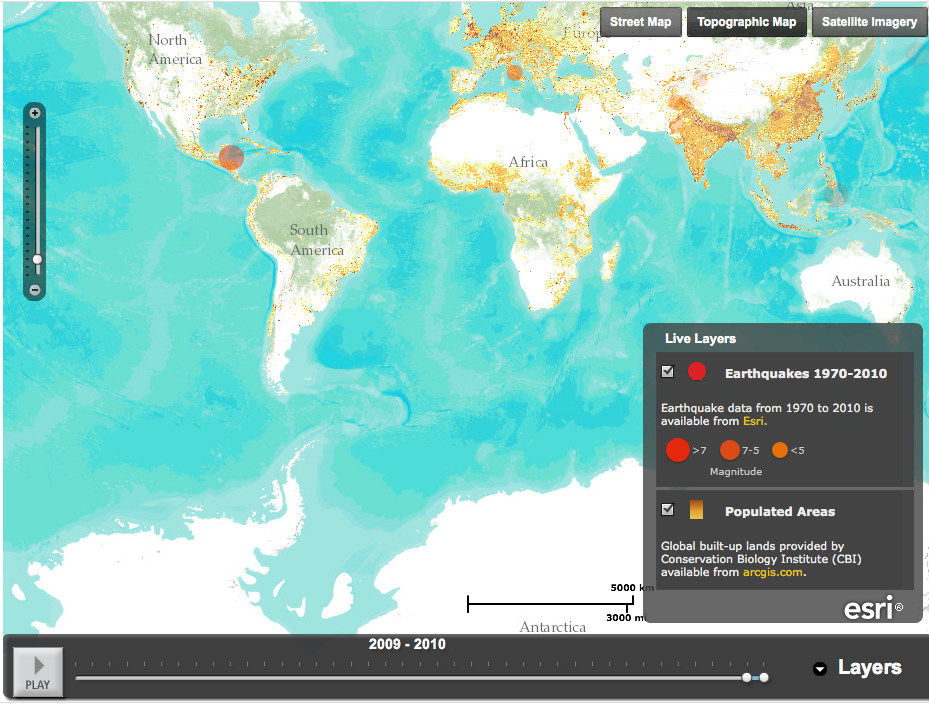
ESRI is a California-based company that encourages companies and not-for-profits to use geographic information software - mapping - to analyze, interpret and understand data. The company also provides extensive maps showing earthquakes, eruptions, and weather events, as part of its disaster response program. Here's a screenshot, for example, of its earthquake timeline map, showing 2009-2010. Note the background of populated areas; by layering the earthquake data on top the map tells you a lot of information quickly.
 (Since this is a screenshot it won't play; click here for the ESRI map.)
Telling a story with maps is something ESRI actively encourages - and teaches people how to do on its web site. Here, for example, is an app that lets users follow the Olympic torch relay through the UK. You choose a day, you choose a town and you get a map and a flicker stream of pictures of the torch relay from that day. The site also has an explanation of story maps, templates, and (in pdf) a step-by-step guide to developing a story map.
It's a very clear, well thought through website - I learned about it from James Fallows' blog, where he posted an ESRI map overlaying the storm strength in DC and Maryland this week on top of "social vulnerability" detail, ie, data showing where elderly or low-income people might be. These (there is a regional map, along with detailed maps of Baltimore and Washington) are the featured maps on the ESRI site.
Wednesday
How looking at outcomes can give you useful information
Here's another example showing how thinking about outcome measures, and using information available, can spark a larger discussion about priorities and solutions. In today's print and on-line New York Times, reporter Eduardo Porter writes, in an article titled "Numbers Tell of Failure in Drug War,"
are may not be working.
If there is one number that embodies the seemingly intractable challenge imposed by the illegal drug trade on the relationship between the United States and Mexico, it is $177.26. That is the retail price, according to Drug Enforcement Administration data, of one gram of pure cocaine from your typical local pusher. That is 74 percent cheaper than it was 30 years ago. [Link in original.]Porter goes on from there to discuss US and Mexican policies and identifies other numbers, such as the large numbers of people in US prisons, and how many are there for carrying small amounts of marijuana, and how much it costs. And there are uncountable numbers of people dead in Mexico. Porter uses the numbers to raise a number of possible policies the US could adopt. There are a lot of possible arguments among the alternatives, which Porter discusses. But one thing is clear: the decline in the street price of most drugs is a pretty good indicator - outcome measure - that the policies we have adopted
Tuesday
Self quantifiers

Here's a roundup of work some people are doing collecting data about themselves and blogging about it. I'm not entirely sure self-quantifying is the best idea as I can see several data-related problems (how do you really figure out many calories you've consumed? What if you decide to ignore that second handful of potato chips?) I'm not going to address the personality issues, but fortunately, someone on Brooke Gladstone's "On the Media" segment about the phenomenon stated that some people see self-quantifying as narcissism. Practitioners see it as self-improvement. Another person on Gladstone's show said, "Data plus information compiled and organized turns into knowledge. It makes self-improvement inevitable. And I like that."
There's something of a trend becoming evident. Last month, The Atlantic published an article "The Measured Man," about the astrophysicist/computer scientist Larry Smarr's efforts to record and then exploit the data about his bodily functions. (He goes pretty far, perhaps farther than most.)
There are lots of blogs about this issue. A useful one is called "My Year of Data." It's useful because the blogger, Chris Volinsky is a statistician and because he recognizes how measuring what he's doing may change it. And he has made his data available publicly, so you can download and analyze it too.
And that screenshot up at the top? That's the work of Nicholas Felton, a designer. It's beautiful data visualization, and he has posted several years of it, each different.
Monday
Still don't believe it's getting warmer?
We're in the midst of yet another heat wave, with all-time high temperature records set over the weekend in Georgia and Tennessee; cities in North Carolina tied their all-time temperature records. And the temperatures are high. Here's how Andrew Freedman of Climate Central describes them:
And yes, the change is expected to be long-term. Here's a map, also from Climate Central, showing the changes we can expect in US planting zones over the next 30 years.
 That's pretty substantial.
Atlanta set an all-time high temperature record on Saturday of 106°F, beating the old record of 105°F set in 1980. Columbus, GA also set an all-time record, with 106°F, beating the record of 105°F set on June 29, and Macon, GA tied its all-time high of 108°F, which was last observed in 1980, according to the National Weather Service.
Several locations in Tennessee also set all-time record highs on Saturday. Knoxville set an all-time record high of 105°F, breaking the previous mark of 104°F set in 1930. Tri-cities broke their all-time high temperature record of 102 when the temperature reached 103°F.
And yes, the change is expected to be long-term. Here's a map, also from Climate Central, showing the changes we can expect in US planting zones over the next 30 years.

Subscribe to:
Posts (Atom)