One of my very first posts was about Hans Rosling's "200 Countries in 200 Years" video, which shows the growth in income around the world across two centuries. Now here's a link to Rosling's own site, Gapminder.com. It contains links to many of his famous TED conference videos, including the "Magic Washing Machine," embedded below.
But Gapminder has a lot more than that. One of the best pages is the "Health and Wealth of Nations" chart that lets the viewer compare all sorts of metrics around the world. Interested in seeing carbon emissions per person by country? It's there, and also available by region and world wide. Health, education, population, energy, environment work - it's all there, and it's all accessible. There's even a guide for teachers. It's creative and useful. And fascinating.

Monday
More anecdotal evidence of global warning
As if any were needed: the New York Times sports section has an article today describing high altitude glaciers melting. If it weren't such an inappropriate adjective I'd call it chilling. But I suppose scary is the operative adjective. Glacierworks has a graphic photo illustrating the difference in one glacier. Here's how it looks now:

and here's how it used to look:
 Source: Glacierworks
If you haven't seen one of the "Rivers of Ice" exhibits (underway now in London and Beijing) there's another US one slated at the MIT Museum in Cambridge, MA, opening in April.

and here's how it used to look:

If you haven't seen one of the "Rivers of Ice" exhibits (underway now in London and Beijing) there's another US one slated at the MIT Museum in Cambridge, MA, opening in April.
Thursday
Football and grades
You may have seen the story, since it's being widely reported, about a new study by three University of Oregon economists finding a decline in grades, especially among male students, when the school's football team is doing well. You can get the full study ($5) here.
Two things about the article: first, according to the NY Times, the study, while large, looked only at Oregon. Second, the article reports that the study found a correlation, though the comment in the article by the University of Oregon spokesman refers to causation. They're not the same thing. But the study points to yet another manifestation of the negative effects of big-time college sports. If you haven't read it already, read Taylor Branch's careful and thorough article in The Atlantic, "The Shame of College Sports."
Two things about the article: first, according to the NY Times, the study, while large, looked only at Oregon. Second, the article reports that the study found a correlation, though the comment in the article by the University of Oregon spokesman refers to causation. They're not the same thing. But the study points to yet another manifestation of the negative effects of big-time college sports. If you haven't read it already, read Taylor Branch's careful and thorough article in The Atlantic, "The Shame of College Sports."
Tuesday
Perspective matters - interesting chart

McKinsey's larger point, that a map can "correct the misimpression that a viewer's vantage point doesn't influence the way things look" is a valid one.
Monday
10 Years of Student Assessment
Michael Winerip's column in today's NY Times describes a series of statements, retractions, and, well, mistakes in New York State and City's attempts to assess public education. I've written about the City's efforts before, for example here (about the City's school rating system) and here (about teacher ratings). All I want to add now is that coming up with metrics is an iterative process, with lots of starts and do-overs. And, as Regents Chancellor Merryl Tisch continues to point out, the numbers have to mean something. I think that assessment of public education is something that can be done. I'm not sure that relying entirely on test scores is the way to do it.
One way to start fixing primary and secondary education is to provide good preschool education. If you haven't ever done so, take a look at the Highscope/Perry Preschool research material. It's pretty interesting, and, combined with the recent article about the declining number of "universal" pre-K spots (not to mention the inadequate numbers of child care spots) pretty compelling. If even some of the money spent on testing and test prep in the last decade had been spent instead on expanding high quality preschool education, New York's test scores might be showing a different trend.
I will be taking a little time off over the coming weeks for the holidays and don't expect to be posting as often. See you in January!
Friday
"All models are wrong but some are useful"
UPDATE, Feb 9: Kaiser Fung's blog has a useful illustration of the variability point discussed below in a post about representations of LA's annual rainfall, here.
Kaiser Fung, a statistician and blogger (also here - I've written about his excellent site, "Junk Charts," earlier) has written a terrific book about what he calls "the statistical way of thinking." In it, he explains how to think about what happens when numbers don't lie. Here's a screenshot of the cover, from Amazon.

In five easily digested chapters, using events from newspaper reports or even everyday life to illustrate, he makes five basic points about statistical analysis that everyone should know.
1. The average isn't as important as the variability around the average - how large the variation is, how often it happens, and why are all more useful information. Fung illustrates this principle by discussing the wait times for rides at Disney theme parks. Think you have a long wait ahead of you? The "Fast Pass" allows you to come back at a set time, when numbers are lower. You feel as if you are not waiting, but of course you've gone and done something else while you waited.
2. Often, variability doesn't have to be explained by causes - correlation can be enough to make the information useful. Fung contrasts an epidemiological search for an outbreak of food-borne disease with consumer credit ratings. In the latter, correlation is a good enough reason to extend or deny credit. Epidemiologists need to be more cautious, and Fung reiterates Bradford Hill's nine aspects of cause and effect.
3. Not everyone or everything can be aggregated, and aggregation can mask differences. Fung points to differences in SAT scores among black and white students, which are masked when all scores are analyzed together. "Black students of high ability score the same as whites; the scores for low ability students of both races are also the same. And yet the average white student score . . . is higher than the average black student score. Due to superior educational resources, 60% of white students have high ability compared to only 20% of black students." The averages mask the weights, or the greater number of white students in the high-achieving group and of black students in the low-achieving group.
4. Making judgments based on statistics can force you to balance two types of error, over-inclusion and under-inclusion. Unfortunately, these two types are inversely related, so by lowering the chances of one you increase the chances of the other. Fung's example in this case is drug testing for athletes, and he shows that by setting the cutoffs for positive tests very high, there a lot of false negatives among tested athletes. Remember that next time you read a statement saying an athlete has never failed a drug test.
5. Statistical testing can help us decide whether available evidence explains an event. When sellers of Canadian lottery tickets turned up as winners at a rate considerably greater than chance would have us expect, Fung explains, it was unlikelihood of it happening (one in a VERY large number) that set authorities down a path to correct the wrong and change processes so that it was harder for vendors to cheat.
This is a clearly written, lucid book. After carefully setting out and illustrating the five main concepts, Fung demonstrates how statistical tools are often used together, going back to his original illustrations with a deeper explanation. It's very satisfying, and very clear. I highly recommend it.
Tuesday
The pitfalls of evaluation
Who knew? The most e-mailed article on the Stanford Social Innovation Review website is dated 2006, and titled "Drowning in Data." Whether you're a funder or a service provider it's still a useful article to read five years after publication. Data collection, analysis, and reporting is hard, and the article outlines several of the reasons. One is that terminology is not yet standardized - my outcomes may look like implementation to you. Another is that organizations are often over-ambitious, wanting to know about outcomes that can occur only several years down the road without providing funding to develop that kind of information.
The main focus of the article is the disparate data requests generated by funders - and often, each requires its own form for reports even if data are similar. I've had to gather and report this kind of data, and it can be a problem, not least because the process may not generate data that's useful for managing a program.
The article distinguished what it calls "summative" evaluations: did the intervention "work"? from formative evaluations: does the evaluation help the organization "improve"? You can see where I'm going - it's not clear, from this context, what it means to say that an intervention worked, or that an organization improved. One thing I always tell clients is that the process of developing measures is important, and that you're going to be doing it over and over again. (I know, that's really two things.)
I don't think that there's an argument here for not trying to evaluate. But there is very good reason to be thoughtful about doing so.
Sunday
Earthquake magnitudes visualized
The Richter scale for measuring earthquakes is logarithmic, so, as the USGS earthquakes website puts it, "each whole number increase in magnitude represents a tenfold increase in measure amplitude. . . " It's hard to imaging, so here's a startling visualization of the difference in energy by Nathan Becker, a government geologist:
I found this video thanks to Alexis Madrigal's blog on TheAtlantic.com
I found this video thanks to Alexis Madrigal's blog on TheAtlantic.com
Thursday
From Silicon Alley Insider: ATOS, a France-based international IT services company, is switching all its internal communications from email to IMs and an internal social networking interface.
As ATOS puts it on its website:
If you go to the SAI article, notice two things: first, the very interesting chart showing the change in web-based email usage by age. Web-based email is only part of the issue, but still the chart shows an interesting dynamic. Second, and perhaps I am late noticing this, the green links in the article are to advertisers.
SAI calls the ATOS move a bombshell, but the news has spawned an interesting public debate on LinkedIn. What do you think? Brilliant move? Marketing move? Mistake?
As ATOS puts it on its website:
The volume of emails we send and receive is unsustainable for business. It is estimated that managers spend between 5 and 20 hours a week just reading and writing emails. Furthermore, they are already using social media networking more and spend around 25 per cent of their time searching for information.A Facebook-like (or Google +) interface makes sense for an office - you can post information that now you would send in an email to umpteen different people. With a better interface, you can make the information readily available when it's needed, and the internal company newsletter can become more like a blog or a wiki.
If you go to the SAI article, notice two things: first, the very interesting chart showing the change in web-based email usage by age. Web-based email is only part of the issue, but still the chart shows an interesting dynamic. Second, and perhaps I am late noticing this, the green links in the article are to advertisers.
SAI calls the ATOS move a bombshell, but the news has spawned an interesting public debate on LinkedIn. What do you think? Brilliant move? Marketing move? Mistake?
Monday
Some horrifying statistics on children living in poverty,
in two senses of the word.
Charles Blow's column in Saturday's NY Times contains a scathing deconstruction of Newt Gingrich's statements about poor children, in which Gingrich said that poor children do not have people around them who work so they don't develop work habits. Blow's take:
But here's a screenshot of (part of) the accompanying graphic. (The link takes you to the full graphic.)
 (Source: NYTimes.com)
Can you figure out what is going on with these numbers? Neither could I. The colors distinguish whether there are working parents in the household, I get that. And the relative size of the squares tells you how many people are considered "poor" or "extremely poor." But what's with the detailed numbers? Rounding them to the nearest 10 thousand or even 100 thousand would be clearer. And the numbers running down the middle between the two sets of boxes? Notice that they overlap, so that areas with 10% poor households show up twice. I think the Times is trying to show that even in poor neighborhoods, there are lots of working parents. Right, there it is, buried in the text:
Charles Blow's column in Saturday's NY Times contains a scathing deconstruction of Newt Gingrich's statements about poor children, in which Gingrich said that poor children do not have people around them who work so they don't develop work habits. Blow's take:
This statement isn’t only cruel and, broadly speaking, incorrect, it’s mind-numbingly tone-deaf at a time when poverty is rising in this country. He comes across as a callous Dickensian character in his attitude toward America’s most vulnerable — our poor children. This is the kind of statement that shines light on the soul of a man and shows how dark it is.
Gingrich wants to start with the facts? O.K.
First, as I’ve pointed out before, three out of four poor working-aged adults — ages 18 to 64 — work. Half of them have full-time jobs and a quarter work part time.
Furthermore, according to an analysis of census data by Andrew A. Beveridge, a sociologist at Queens College, most poor children live in a household where at least one parent is employed. And even among children who live in extreme poverty — defined here as a household with income less than 50 percent of the poverty level — a third have at least one working parent. And even among extremely poor children who live in extremely poor areas — those in which 30 percent or more of the population is poor — nearly a third live with at least one working parent.So far so good. It's clear that Blow is mad that Gingrich is ignoring a lot of readily available facts. And that the facts are so damning.
But here's a screenshot of (part of) the accompanying graphic. (The link takes you to the full graphic.)

Can you figure out what is going on with these numbers? Neither could I. The colors distinguish whether there are working parents in the household, I get that. And the relative size of the squares tells you how many people are considered "poor" or "extremely poor." But what's with the detailed numbers? Rounding them to the nearest 10 thousand or even 100 thousand would be clearer. And the numbers running down the middle between the two sets of boxes? Notice that they overlap, so that areas with 10% poor households show up twice. I think the Times is trying to show that even in poor neighborhoods, there are lots of working parents. Right, there it is, buried in the text:
And even among children who live in extreme poverty — defined here as a household with income less than 50 percent of the poverty level — a third have at least one working parent. And even among extremely poor children who live in extremely poor areas — those in which 30 percent or more of the population is poor — nearly a third live with at least one working parent.These are important data. There's got to be a better way to show them graphically.
Sunday
"Steve Jobs" by Walter Isaacson
Here's a link to my review of Walter Isaacson's biography of Steve Jobs pm the Brooklyn Bugle. I don't think this bio is going to be the last word on the subject of Jobs and his legacy, but it's a terrific beginning.


Thursday
In honor of Durban, more on global warming
Here's a link to an article from New Scientist via Slate, about extreme weather events, global warming, and a new technique British meteorologists want to use that considers the odds of particular events to assess the extent of human-induced climate change involved. (You know: was Hurricane Katrina really a 100 year storm, or was it worse than it might have been because of global warming?) Peter A. Stott, a climate scientist in the UK, wrote the article. We don't have a good enough system yet, he says, but:
Sometimes it helps to go outside US news sources, and today's BBC World News Service has a fascinating interview with David Attenborough about his new programs about global warming. I can't find a direct link to the interview, but you can listen to the BBC's webcast here. The Attenborough interview is in the Newshour.
And, FWIW, since I use Wikipedia a lot, here's a link to the Tech Crunch blog post complaining about the placement of Wikepedia's fundraising pleas.
What we need is an attribution system, operated regularly like the weather forecast and made available to the public. Its purpose would be to deliver rapid and authoritative assessments of the links, if any, between recent extreme weather events and human-induced climate change.
In the event of, say, a severe flood, the system would provide estimates of the extent to which the event was made more or less likely by human-induced climate change. It would also take into account alternative natural explanations such as the El Niño Southern Oscillation, a large-scale climate pattern in the tropical Pacific Ocean that affects weather worldwide.Such a system would be useful - it's hard to tell from one day to the next what is causing particular weather events. And it might even move the discussion in the US from whether climate change is happening to what to do about it.
Sometimes it helps to go outside US news sources, and today's BBC World News Service has a fascinating interview with David Attenborough about his new programs about global warming. I can't find a direct link to the interview, but you can listen to the BBC's webcast here. The Attenborough interview is in the Newshour.
And, FWIW, since I use Wikipedia a lot, here's a link to the Tech Crunch blog post complaining about the placement of Wikepedia's fundraising pleas.
Wednesday
Taking action, free will, and neuroscience
If you're interested in the science of how we make decisions, here's a link to a "Scientific American" interview with Michael S. Gazzaniga, a psychologist at UC Santa Barbara. It's not so clear, he says, that we even have free will:
And if you're really interested in the subject, I highly recommend In Search of Memory: The Emergence of a New Science of Mind by Eric Kandel, for a great memoir/explanation of modern brain research.

Whatever your beliefs about free will, everyone feels like they have it, even those who dispute that it exists. What neuroscience has been showing us, however, is that it all works differently than how we feel it must work. For instance, neuroscientific experiments indicate that human decisions for action are made before the individual is consciously aware of them. Instead of this finding answering the age-old question of whether the brain decides before the mind decides, it makes us wonder if that is even the way to think about how the brain works.For another view, take a look at "The Neuroeconomics Revolution" by Robert J. Shiller, a professor of economics at Yale.
And if you're really interested in the subject, I highly recommend In Search of Memory: The Emergence of a New Science of Mind by Eric Kandel, for a great memoir/explanation of modern brain research.

Monday
The limits of prediction, and what you can do about it

And that's not so easy. A recently released report, "Driving in the Dark: Ten Propositions About Prediction and National Security" by Richard Danzig, of the Center for a New American Security, explains why, and what we can do about it. We need to assume that long-term strategies will be wrong, and our predictive capacities limited, Danzig says. “Planners need to complement their efforts at foresight with thinking and actions that account for the high probability of predictive failure.”
Written with the military in mind, Danzig makes his case in 10 propositions, five descriptive, five prescriptive. Starting with the premise that experience and social science literature demonstrate that long-term predictions are consistently mistaken, Danzig points out that in the long range national security will continue to present unpredictable issues and confound prediction, and that planning across a range of scenarios will not prevent predictive failure. These insights are equally applicable to not-for-profits and governments as well.
So what to do? Danzig says, “Policymakers are right to attempt to enhance their understanding of the future, but such efforts need to be complemented with a better recognition of likely failures of foresight. I recommend schizophrenia: People must simultaneously predict and plan for predictive failure.” He suggests that policymakers speed up decision making when they can, but insist on making some decisions as late as possible. Adaptability should be a priority. And nurture diversity and competition, because they produce a broad range of potential responses when the unpredicted events happen. Again, these insights are generalizable to public sector and not-for-profit managers (though much of Danzig's second half is more relevant to the US military). But this paper is clearly written, and anyone with an interest in defense, or budget issues, or politics, will find it worth reading.
I found this paper because I read James Fallows' terrific blog about politics at The Atlantic.
Another interactive display of data

But not for the next few days - I'll be off until next week for Thanksgiving.
Heart rate and fitness monitoring in soccer preparation
Saturday's NY Times had an interesting article about the U Conn soccer team's approach to fitness using athlete heart rates to make the season's workouts as efficient as possible. (The article has a screenshot of a readout, but it won't reproduce well here, so click through to see it.) The focus on individual athlete data means that coaches can see who needs to rest or recover, as well as who could be working harder.
Wednesday
Globaia maps the Anthropocene
Globaia, an organization dedicated to fostering understanding of environmental issues, has released a series of maps and photos documenting our present geological age, which is starting to be called the Anthropocene, or age of human effects upon the Earth. Whether you call it the Anthropocene or Holocene, the pictures and graphics are telling--it's a great use of mapping software--and also eerily beautiful.
Click through the Globaia site, there are very many pictures. If you have any doubt that humans are having an impact on the global environment, take a look at its clickable graphic "The impact of a global temperature rise of 4 degrees C." (Screenshot below).

Click through the Globaia site, there are very many pictures. If you have any doubt that humans are having an impact on the global environment, take a look at its clickable graphic "The impact of a global temperature rise of 4 degrees C." (Screenshot below).

Monday
Using a story to illuminate the statistics
Today's New York Times carries a compelling column by Harvey Araton about Dr. Richard Lapchick and his work examining racial bias in big-time sports, both professional and college Division I. The Institute for Diversity and Ethics in Sport (TIDES), which Lapchick directs, has links to many of the reports, including graduation rates in Division I college football and basketball (women's too), and hiring in the front offices of the NBA, NFL, MLB, and MLS. TIDES also produced an interesting report about the racial and ethnic makeup of the ad agency creative directors who made ads for the 2011 Super Bowl (mostly white males) and the content of the ads. As the report puts it,
Lapchick's personal story, as Araton tells it, is just as important. To quote the article:
In addition to the continuing use of gratuitous sexual content, this year's bundle of ads managed to depict some women in an antagonistic manner featuring a number of ads portraying men attempting to appease their overbearing girlfriends. There was also a lack of people of color featured as main characters in the advertisements.The report goes on to state the (huge) numbers of African-American, Latino, and female viewers of the 2011 Super Bowl.
Lapchick's personal story, as Araton tells it, is just as important. To quote the article:
In a voice measured and firm, he told of being brutally assaulted more than 30 years ago for asserting that sports was a vehicle from which to propagate change — and having the word nigger, misspelled with one G, carved onto his stomach with a pair of scissors.In other words, once he's got his audience's attention with one compelling episode, Dr. Lapchick can relate the bigger story the statistics tell. And that's a lesson worth remembering.
. . . In an instant, eyes widened. Jaws dropped. Mission accomplished, Lapchick unleashed his statistical barrage, aiming to quantify how far sports has come in the pursuit of racial and gender diversity — and how far the industry still has to go.
Thursday
Predictive data modeling using Kaggle
Kaggle is a startup tech site that lets organizations post datasets and ask world wide users to predict how their customers, clients or patients will behave. It's set up as a competition, and the organizations pay for the best solution with a prize. Here's Kaggle's video explanation:
Kaggle claims on its website always to have outperformed pre-existing accuracy benchmarks, because it draws on a wide range of competitors who keep trying to better each other's work. I can see many applications in social services and yes, you can post scrubbed, anonymous data; you can even post variables as A, B, C without stating what the variables are.
Competitors have already improved NASA's algorithms for mapping dark matter; there's a competition under way to predict hospital stays; and there are classroom applications available so that students can use unknown datasets.
I learned about Kaggle from an Atlantic posting called "The 20 Most Innovative Startups in Tech" by Rebecca Rosen. Check out the article for more interesting websites.
Tuesday
Mapping Gothic France
 It's still in beta, and not all the data are loaded yet, but even so the website Mapping Gothic France, put together by art historians Stephen Murray of Columbia and Andrew Tallon of Vassar, is amazing. The home page maps the Gothic cathedrals of France, and provides a link to an arch design simulator - you can stretch a Romenesque arch into a Gothic one. There are animated maps showing the spread of Gothic architecture, and links to essays in called "Stories of Gothic."
For each cathedral, the site includes plans, elevations, timelines, a history and chronology, and a monograph. And photos, many high quality, high resolution photos. (The Columbia Record reports that the project used both a 40 megapixel camera, and a gigapixel camera.) The photo is a screenshot from a panoramic view from the center of the Cathedrale Notre-Dame in Chartres.
Each cathedral also gets a series of plans, from crypt to roof, with images and panoramic photos clickable on the diagram. Here's a screenshot of the Chartres ground level plan:

(NB: It's a screenshot, so you can't click on it here, but go to the site.)
You can also compare the cathedrals by their various schematics, including nave heights, aisle heights, or floorplans. Here is a screenshot of the parametric sections, sorted by nave height (that's the red figures, too small to see here, though not on the site). There are three stacking options, depending on how you want to look at the photos or data.

The site does more: it allows a viewer to compare the facades of different cathedrals. You can look at groups from different parts of the country. There are definitions of architectural terms. Altogether, it's an impressive way to think about storing and displaying a huge amount of information that exists in different forms.
If you're looking for your favorite cathedral, you may have to wait a bit - Albi's information is partly loaded, Conques and Avignon are not, yet. Surfing the site is not quite a visit to France, but definitely spend some time on it if you're planning a trip. If you're not, it's still a fascinating way to spend a couple of
Thanks to Dan Richman for telling me about Mapping Gothic France.
Monday
NYC Marathon Graphics and Sports Stat Quiz
The NYC Marathon was run yesterday (in case you missed it). In preparation, on Saturday the NY Times carried a graphic showing changes in population and income along the race route since 1976, when the race expanded to all five boroughs. A screenshot of the Times graphic is below.
 I watched the race for a while from Fourth Avenue between Carroll and Garfield Streets, towards the end of Mile 8. I saw the runner I planned to meet there, and then I saw two others I hadn't. What are the chances of that? More than 48,000 runners started.
On Sunday, the Times' Education Supplement carried an article about sports statistics classes, and you can try to figure it out yourself. Or you can try some problems with real solutions in the Times quiz here.

On Sunday, the Times' Education Supplement carried an article about sports statistics classes, and you can try to figure it out yourself. Or you can try some problems with real solutions in the Times quiz here.
Thursday
Caveat lector
Update: Here is a link to an interesting article in the Chronicle of Higher Education about the same topic, "Fraud Scandal Fuels Debate Over Practices of Social Psychology."
This is a follow-up to my post earlier this week about the increase in retractions of articles by scientific journals - today's New York Times carries a story about a Dutch psychologist, Diederik Stapel, who appears to have faked a lot of work, including data and entire experiments. There's concern about the students who obtained PhDs under his guidance as well. The Retraction Watch blog has been covering the report the Times mentions, and it all makes pretty discomfiting reading.
As the Times article goes on to discuss, there is a bigger story, especially important for people who use social science data:
You can find a copy of the Wicherts and Bakker paper here, in English. The Leslie John paper is not yet published, but I will keep an eye out for it.
This is a follow-up to my post earlier this week about the increase in retractions of articles by scientific journals - today's New York Times carries a story about a Dutch psychologist, Diederik Stapel, who appears to have faked a lot of work, including data and entire experiments. There's concern about the students who obtained PhDs under his guidance as well. The Retraction Watch blog has been covering the report the Times mentions, and it all makes pretty discomfiting reading.
As the Times article goes on to discuss, there is a bigger story, especially important for people who use social science data:
The scandal, involving about a decade of work, is the latest in a string of embarrassments in a field that critics and statisticians say badly needs to overhaul how it treats research results. In recent years, psychologists have reported a raft of findings on race biases, brain imaging and even extrasensory perception that have not stood up to scrutiny. Outright fraud may be rare, these experts say, but they contend that Dr. Stapel took advantage of a system that allows researchers to operate in near secrecy and massage data to find what they want to find, without much fear of being challenged.
“The big problem is that the culture is such that researchers spin their work in a way that tells a prettier story than what they really found,” said Jonathan Schooler, a psychologist at the University of California, Santa Barbara. “It’s almost like everyone is on steriods, and to compete you have to take steroids as well.”
. . .
In a survey of more than 2,000 American psychologists scheduled to be published this year, Leslie John of Harvard Business School and two colleagues found that 70 percent had acknowledged, anonymously, to cutting some corners in reporting data. About a third said they had reported an unexpected finding as predicted from the start, and about 1 percent admitted to falsifying data.
Also common is a self-serving statistical sloppiness. In an analysis published this year, [Jelte] Wicherts and Marjan Bakker, also at the University of Amsterdam, searched a random sample of 281 psychology papers for statistical errors. They found that about half of the papers in high-end journals contained some statistical error, and that about 15 percent of all papers had at least one error that changed a reported finding — almost always in opposition to the authors’ hypothesis.
You can find a copy of the Wicherts and Bakker paper here, in English. The Leslie John paper is not yet published, but I will keep an eye out for it.
Tuesday
Using numbers to improve airline boarding procedures
I took two flights over the weekend and neither one boarded efficiently. You may have seen the article in this morning's New York Times about increasing the efficiency of boarding. The online version contains a link to this nifty site, Airplane Boarding, which has animations of different ways to board. (Screenshot below - I can't embed the video). It's created by a U of Colorado Business School professor named Menkes van den Briel.

van den Briel links to another site, Round Peg, showing a better way yet to board, one the creator, Rob Wallace, calls the "Flying Carpet." That page also has an animation. I can't embed it, either, so go take a look.

van den Briel links to another site, Round Peg, showing a better way yet to board, one the creator, Rob Wallace, calls the "Flying Carpet." That page also has an animation. I can't embed it, either, so go take a look.
Increasing numbers of retractions - and graphing them
Here's a link to an article in Nature that describes an increase in the number of retractions of scientific articles worldwide in the past 10-15 years. It's worth a look for at least two reasons.
First, the chart, (or charts, there are three) illustrating the article (screenshot below) is (are) particularly clear. The axis starts at 0, the colors are consistent, and the author, Richard Van Noorden, makes sure to point out that some journals are more influential than others.


Second, the issue of retractions generally is one that deserves broader amplification. I depend a lot on the research of others, and learning that something has changed is a useful reminder not to finish my research too early. Van Noorden makes some suggestions for reform of the non-system we have now for retractions of scientific articles, such as better ways to link retractions to the original reports, and also some mechanism to distinguish honest mistakes from fraud or massive error. Van Noorden also identifies a blog, Retraction Watch, that tracks "retractions as a window into the scientific process." If you're curious, it's a fun blog to explore.
Thanks to Arts and Letters Daily for pointing to the article.
Monday
Cancer screening, questioned
Here's a thoughtful article by Gina Kolata from Saturday's NY Times, assessing the spate of new guidelines suggesting that less cancer screening may be a better public health approach. I've discussed this issue in earlier posts, particularly my review of "Overdiagnosed," here (and the article quotes the book's principal author Dr. H. Gilbert Welch). Cost and a new understanding of cancer--including the fact that many cancers do not grow at all or grow slowly--have led to the recommendations of less screening.
Wednesday
Improving data displays
I've just come across a website, Junk Charts, that illustrates and identifies some of the many problems you can stumble across illustrating data using charts. It's a very useful resource, as the author Kaiser Fung always explains what is wrong with each chart and illustrates how to do it better. Take a look at his post on the USDA's pie chart explaining healthy diets, here, for example.
And here's a screenshot of another, one where Fung argues that pie charts should be abolished.
 And a final example, in which Fung illustrates exactly whose taxes would be lower under the 9-9-9 proposal (hint: it's not who you might think).
Altogether, an entertaining and instructive site.
And here's a screenshot of another, one where Fung argues that pie charts should be abolished.

Altogether, an entertaining and instructive site.
Monday
"One for the Road," by Barron Lerner
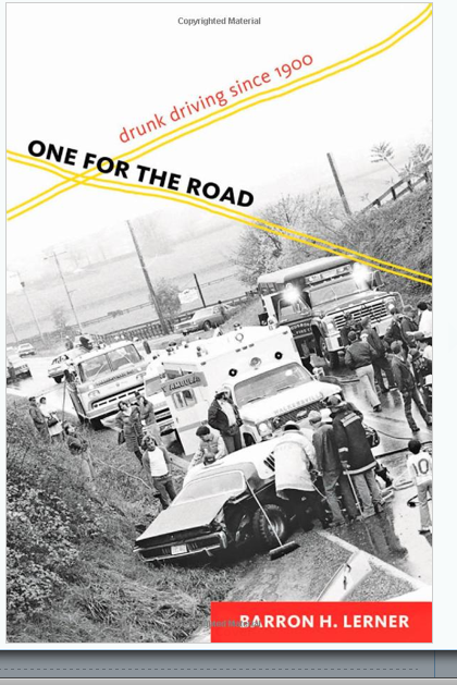
If you came of age in the 1970s and 80s it seemed as if MADD—Mothers Against Drunk Driving—and its anti-drunk driving message were everywhere, and that the US culture embraced a clear consensus: drinking and driving should not be done together, ever. But, according to Barron Lerner’s new history “One for the Road,” it didn’t have have to be this way. (Even MADD changed its name; at the start it was ‘Mothers Against Drunk Drivers.’)
In contrast to a long history of regulating impaired driving elsewhere in the world, particularly in Europe, in the US, habitual respect for individualism clashed against the imperative to protect everyone from an impaired person driving a car. Everything was fought over, from the reliability of the various mechanisms that calculate the amount of alcohol in the blood, to the idea of linking a level of Blood Alcohol Content to a degree of impairment (who knew that Indiana would be a leader in this regard?). Some people argued that social drinkers could drive safely. Others argued equally strenuously that it was heavy drinkers who could, since they knew how to hold their liquor.
I have written elsewhere (here and here for example) about the importance of understanding the context and uncertainties of statistics someone is wielding to prove a point, and Lerner highlights the issue in his book:
The debate [about the effectiveness of efforts to control drunk driving] nicely demonstrated a perpetual challenge of activist movements: balancing fervor for a cause with justification from the available scientific data. How much scientific ‘proof’ is necessary for activists to forge ahead with seemingly just and moral agenda? Successful public health movements to control infectious diseases, prevent smoking-related lung cancers, and remove lead from paint, to name just a few, relied on suggestive—not definitive—data. This strategy has been termed the ‘precautionary principle.’ Waiting for the science, in retrospect, would have cost lives.
In lucid and unadorned prose, Lerner takes a step back from the tangles, and considers the social, cultural and enforcement issues of driving while distracted (studies have shown that the cognitive efforts required to talk on the phone create as much of an impairment to the judgment and reaction times you need while driving as driving drunk can; texting while driving takes your eyes off the road). Whether driving while impaired or distracted is viewed as a law enforcement problem, a public health problem, or an illness, American individualism, he concludes, will always make protecting Americans from drunk drivers an issue. Lerner has described this as his “preachiest” book ever; I don’t think so. In an earnest tone, he lays out a compelling case for strict driving laws. His conclusion is clear: it’s to protect all of us against the massive damage an impaired driver can cause.
Tuesday
School rating and sports ranking methodology (and tennis)

I've occasionally thought that the Association of Tennis Professionals ranking methodology would provide some guidance or useful ideas for the folks who develop and report the New York City elementary school annual ratings. It's not an entirely fanciful notion. Tennis players must enter tournaments, and earn ranking points for progressing through the elimination rounds. Professional tennis and elementary education are not really analogous, of course. But all the same, the tennis rankings, while complex, take account of players who finished the previous year high in the rankings - and therefore can't move up.
Now I've come across another website, Greatest Sporting Nation, whose methodology New York City Department of Education might also want to take a look at. The Greatest Sporting Nation purports to identify which country competing in international competitions is the greatest overall at sports. (It also ranks countries on a per capita basis, as well ranking each sport, and male and female athletes, separately.) The website is well written and explains itself quite clearly. The first metric I'd suggest the New York City Department of Education take a look at is the Global Ranking, a ranking based on performances over the previous four years. Looking at a longer time frame might give New York City parents a better sense of how the school their kids attend has been performing. I'd also like the schools to take a look at the Per Capita Cup, which measures performance taking account of population size.
Just saying.
Medical statistics and decision-making
Back in April, I discussed Welch, Schwartz, and Woloshin's excellent book "Overdiagnosed: Making People Sick in the Pursuit of Health" in a post. The authors assume readers will want to focus on the numbers, and provide a clear guide to interpreting medical advice that comes your way. I was reminded of it several times in the past week. First the US Preventive Services Task Force issued a draft statement recommending against PSA screening for asymptomatic men.
Second, the NY Times Magazine discussed PSA testing in an article on Sunday titled, "Can Cancer Ever Be Ignored?" FWIW, the article quotes Welch as saying, “The European trial says 50 men have to be treated for a cancer that was never going to bother them to reduce one death. Fifty men. That’s huge. To me, prostate screening feels like an incredibly bad deal.”
Third, last week I read Jerome Groopman and Pamela Hartzband's newest book "Your Medical Mind: How to Decide What is Right for You." That book is not a numbers book by any means, but it does provide several spectra intended to help the general public figure out how to respond when a doctor proposes tests, medication, or other procedures. Written in the clear style we have come to expect from Dr. Groopman, it is pitched at a level you can take in while distracted by the emotions and time pressures of a medical crisis.
Friday
Protected Health Information, or using other people's data
The New York Times carried a front-page story yesterday about the release of patient data from Stanford Hospital that provides several useful lessons for those of us who spend our work lives mucking about in files and spreadsheets.
It appears that the hospital sent the file to someone they believed worked for one of their business associates. He did, but evidently as a marketing contractor, not an employee, though he did use an email address of the business associate. According to the story, the marketing contractor sent the file to a prospective employee of his, who posted it on a public paid homework help site.
What could have been done to prevent this breach? The file moved several times; each time, the sender or receiver could have at least wondered whether it contained live data. The hospital could have alerted the marketing contractor that the file had live data. The marketing contractor could have looked at the file before sending it on to the job applicant, or had her complete the assignment in his office.
So what are the lessons? Leaving technical issues aside (though you can read the next paragraph if you're interested in those) I think there are two: first, look at the file before you send it on! And second, when you get a file, think about what might be in it before you pass it on. (There's a third lesson in there too, about not asking for help publicly when you are trying to demonstrate a skill necessary for a job, but I'm inclined to skip over that one.)
More technical paragraph: Under HIPAA, the Health Insurance Portability and Accountability Act, "business associate" is a carefully defined term of art, usually an organization that provides computer, analytical, or other services to the health care provider. Business associates often need access to confidential health information (one of the services they provide is billing; another is reimbursement) and are generally hedged in with contracts spelling out what they can and cannot disclose. The people who know what is in the contracts may not be the same people with operating responsibilities, and I suspect that training around confidentiality issues is not enough. You need constant reminders too.
Monday
Two Strategy Articles from McKinsey Quarterly
I'm summarizing two helpful articles from the McKinsey Quarterly.
In "The Perils of Bad Strategy," Richard Rumelt lists four elements that result in poor strategy. They are:
1. Failure to face (or identify) the problem - if you don't know what stands in your way, you won't be able to solve it.
2. Confusing goals with strategy - establishing a goal isn't enough. You need to know why you are trying to reach that goal; as Rumelt puts it, the strategist's task is "to have a strategy worthy of the effort called upon."
3. Poorly stated strategic objectives - if your goals are general or fuzzy or there are simply too many of them, you won't be able to focus on the crucial ones.
4. Fluff - if your goals are fluffy, or "superficial abstraction[s]" they signal that you haven't thought them through.
Fortunately, Rumelt also lists three elements of good strategy: a diagnosis, a guiding policy, and coherent steps to get you from here to there.
As always, it's easy to say these things, and harder to do them. Rumelt provides some useful illustrations and examples. The second article, "Have you Tested Your Strategy Lately?" by Chris Bradley, Martin Hirt, and Sven Smit, digs down a little deeper by offering ways to test your overall strategy, as well as various aspects of it. While clearly written with for-profit businesses in mind, the tests, with a little tweaking, can be applied equally well to not-for-profits.
Tuesday
Stabilizing fossil fuel emissions
Here is a great graphic from Climate Central reaffirming the "wedges" analysis for slowing climate change - and demonstrating how much more needs to be done than when the first analysis appeared in 2004.


The graph illustrates the concept of the "stabilization triangle," which two Princeton professors, Robert Socolow and Steve Pacala developed to illustrate the efforts that would need to be made to limit the rate of emissions of greenhouse gases. You can read the Socolow's blog explaining it here, and James Fallows' clear gloss here. (I follow Fallows' blog and that's how I found the graphic - thank you.) I recommend reading both pieces for more details, but the short point is vividly illustrated in the graphic. In 2004, there were seven distinct wedges - things that would have to be done - in the stabilization triangle. Now there are 9. And the data are from 2008 (2001 in the first iteration) so they understate the problem.
In his blog post, Socolow argues that advocates are partly at fault for urging prompt action without acknowledging psychological barriers to receiving unwelcome news (I've written about that cognitive bias before), how much about climate science is still unknown, and how risky possible solutions can be. He then goes on to argue persuasively for something he calls "iterative risk management:" looking at a 50 year horizon with 10-year or shorter increments for reduced emissions goals, and taking advantage of increased knowledge (and, one hopes, positive feedback from actions) when setting new targets. It's very clear and well worth taking the time to read.
Monday
Managing the Unexpected
Managing the Unexpected: Resilient Performance in an Age of Uncertainty, (2007) by business school professors Karl E. Weick and Kathleen M. Sutcliffe, is a much-praised business practices book for those who want, or need, to step out of their comfort zones. The book brings many of its examples from what it calls "High Reliability Organizations" or HROs - businesses that need to anticipate surprises and uncertainty, like woodland firefighters or nuclear power plant operators. Some of the knowledge set out here can usefully be applied to the operations of a not-for-profit providing human services or arts support.

A crisis, or what the authors call a brutal audit, tests a program's operating systems - and everything that is unprepared becomes a weakness in a crisis. So what's their prescription? Operating in a manner that the authors call mindfulness. More specifically, that means:
* Pay close attention to weak signals that may be symptoms of larger problems
* Don't be too willing to interpret or simplify
* Pay attention to operations - ie, the be responsive to the messy reality that exists within even the most carefully designed systems
* Respond to the unexpected by improvising if you have to, and using expertise where you find it and
* When you have a near-miss, look at it as an opportunity to learn.
Despite its unfortunate lapses into B-School jargon and some generality of expression, this book has several extremely helpful audits and tips, and includes the best discussion of understanding and changing organizational culture that I have ever read. It took a while to understand what the authors mean by "mindfulness," and I finally concluded that it means something like the watchfulness you have to have when you're driving - driving itself doesn't take too much effort, but you need to be aware of what's happening around you so you can respond when the car in the next lane drifts into yours. (And that's why talking on the phone while you're driving is such a risk.)
I was also provoked by the authors' insistence that managing by the numbers is not necessarily a useful practice in high reliability organizations, since the usual thesis of this blog is that managing by numbers is important. But on further contemplation I concluded that managing by numbers is an important first step, and that what you conclude from the numbers is where you have to be mindful. After all, interpretation of results is a form of simplification, as is categorization. When you're using numbers, you do have to reexamine them at least annually, and the lens of mindfulness that Weick and Sutcliffe lay out is an extremely useful one.
Tuesday
Updated: Continuing the mistakes theme with Netflix . . .
Update, December 13: To thank me for still maintaining a dvd subscription, Netflix is offering me a "free bonus DVD rental to supplement" my subscription. So I get to have three out at once. I can still watch only one at a time, when I have time, but I guess I appreciate the gesture. I did click on the link. Any thoughts on this gesture?
Update, October 10: Netflix has announced this morning that it is not splitting in two, "This means no change: one website, one account, one password . . . in other words, no Qwikster." They're also trumpeting their new marketing deals and streaming arrangements. Maybe this was the plan all along?
or perhaps not. Slate's Farhad Manjoo argues in this post that Netflix CEO Reed Hastings' announcement Sunday morning that the company is splitting in two, with Netflix to keep the streaming business and a new company, Qwikster, to mail DVDs, may have been a very smart move. And, counterintuitive though it sounds, that's because the announcement alienated customers.
What do you think of the Netflix decision? Manjoo's argument? Post a comment!
Sunday
Andrew Thompson talks culture
The "Corner Office" column that the NY Times runs on Sundays is often interesting reading, but I normally don't link to them. This week's, a condensed conversation with Andrew Thompson of Proteus Biomedical, is different: read it here. What Thompson says throughout about creating culture is interesting: he's very clear about how important it is to recognize failure, and not punish it, because without trying new things you won't be able to identify approaches, or ideas, that work. It's also worth reading on to see what he says about horizontal structures, and the true function of leadership. (And there's a nice tennis metaphor, one that can be carried even further: you don't want to let the person on the other side of the net get inside your head. It's as true in the workplace as it is on the tennis court.) The attitudes Thompson brings to his business definitely have a place in the not-for-profit world.
Wednesday
The science of grunting. Really.
Several websites have run articles lately on the noise players at the US Open and other tennis tournaments make when they hit the ball. And, it turns out, they may be on to something. Discovery News reports that a post-doc at the University of British Columbia found that a sound made as a ball is struck significantly slows response time, and affects responses.
Here's a link to a Slate story about the first grunting tennis player, Victoria Heinicke.
And a modern example:
Here's a link to a Slate story about the first grunting tennis player, Victoria Heinicke.
And a modern example:
Friday
Blue Avocado, a very useful website
I've occasionally come across the name Blue Avocado - it's a blog that offers "practical, provocative, and fun food-for-thought for non-profits." It's easily searchable, and includes links to related topics at the end of every article. Just this morning I started out looking at examples of ground rules for meeting facilitators - Blue Avocado offers a very Gen Y example - and from there went on to useful articles about succession planning, executive sessions during board meetings, and board development. It's a useful and eminently readable resource.
Here's a screenshot of those Gen Y ground rules:

Here's a screenshot of those Gen Y ground rules:
Thursday
Making mistakes, and learning from them
Challenging as it can be to admit, we all make mistakes. But as I've pointed out in this space before, and as Alina Tugend describes in her new book Better by Mistake: The Unexpected Benefits of Being Wrong, mistakes, if they are acknowledged and looked at, are an opportunity. Tugend quotes John F. Kennedy on that point, "as a wise man once said, 'An error does not become a mistake until you refuse to correct it.'"
 Different cultures approach mistakes and learning from them differently, and Tugend argues that we need to change our approach to mistakes, if only so as not to get caught up in a dead-end perfectionism. Perfectionism can be paralyzing in any circumstances, she points out, but particularly so if we live or work in an inflexible environment where blame is cast around. The solution, she says, is to figure out what can be learned from a mistake "and fix the lesson, not the blame." (Tugend relates a story of the CEO who rejected the resignation offer of a subordinate who had just made a big mistake saying,"Are you kidding? We've just spent $10 million educating you.")
This is not a management book (there's no mention of Deming, for example, or root cause analysis), and it's not a parenting book, though Tugend uses examples from her own household. It's an exploration, and as a result Tugend packs quite a number of themes, from middle school math to effective corporate apologies, into it. But Tugend lists several ways that we can each change ourselves. Taken together, these would make an office, or a household, more inviting and in all likelihood more creative. They are:
* Emphasize effort, not results.
* Appreciate that we can't be perfect.
* Take risks, challenge ourselves, and don't fear failure.
* Solve problems, don't place blame.
* When you're solving the problems, keep lines of communication open, and remember that communication goes both ways.
But if you work in an office, how do you know when you've made a mistake? Especially when you're the boss? When you're a senior staff member or an executive, you may not always get the information you need - you may be hearing only what you want to hear. And unless you ask in the right way, you're not going to get feedback about your personal style. Robert S. Kaplan, a professor at the Harvard Business School, sets out a few ways for senior staff to get this kind of information in the September 2011 issue of the McKinsey Quarterly. Among his suggestions:
* Ask your staff about how you can improve. I tried doing this once, and got nowhere, but Kaplan offers a specific, workable process that would have worked for me.
* Ask yourself what facts about yourself might help your staff understand you - and then tell them.
* Find some mechanism for your staff to debate, openly, all the key issues they are dealing with.
* Do what Kaplan calls the "Clean sheet of paper" exercise - ask your staff to consider what your operation might look like if you started from scratch.
This is a short article, and useful for anyone managing staff as well as senior executives.
Tuesday
NYS Assembly Grants Action News
The New York State Assembly provides an electronic resource, "Grants Action News," identifying newly available state, federal, and private grants in a wide range of areas, from social services to sciences to arts. It regularly identifies funding opportunities for individuals, like this month's NEH 2012 summer grant program. And every issue includes information on grantwriting resources.
Here's a screenshot of some of the September issue:

Grants Action News went online in January, 2008, and you can access the archives here. It's a useful resource if you use it in conjunction with other grants research. You can subscribe by sending an email to grants@assembly.state.ny.us or by printing, completing and mailing this form.
Friday
Greg Mankiw's Blog
Greg Mankiw is a professor of economics at Harvard who has also written several economics textbooks, including an increasingly popular introductory one. His blog, "Random Observations for Students of Economics" is clever and entertaining, with lots of useful information for anyone interested in economics (and who isn't these days?) as well as students.
A couple of useful posts:
* Here's Mankiw's "summer" reading list of basic books about economics - some I've read, some I think I will.
* And here are two ways to remember 10 basic principles of economics in limerick or easy-to-remember rap form.
A couple of useful posts:
* Here's Mankiw's "summer" reading list of basic books about economics - some I've read, some I think I will.
* And here are two ways to remember 10 basic principles of economics in limerick or easy-to-remember rap form.
Wednesday
Sharing a data dashboard
When you are the City of New York, sharing data -- a good thing -- inevitably means that someone will criticize you. The city shares its performance data through something called the Citywide Performance Rating; it's available here. It's a successor to the old Mayor's Management Reports and collects and reports on city agency performance in eight major areas (called "Themes" on the city's website): Citywide Administration, Community Services, Economic Development and Business Affairs, Education, Infrastructure, Legal Affairs, Public Safety, and Social Services. The data are updated monthly.
Here's a screenshot of the Citywide Performance Data main page:

In future posts I'll look at each area in more detail. For the moment, here's a link to an unusually thoughtful article in the NY Times about using data - and, perhaps just as much, about the vicissitudes of making one's data dashboard public.
Monday
On hurricanes and predictions
Updated 30 August
It's become fashionable in the last 24 hours, now that Irene has come and gone from New York City, to say that officials overreacted and that NYC's mayoral administration, in particular, had to live down its dismal performance during last year's snowstorm. Here's how a local street looked for several days after that storm:

But I don't think Mayor Bloomberg overreacted to the threat Hurricane Irene posed (for one thing, it's too easy to say that after the fact; for another, there were big trees down in my neighborhood and flooding not so far away). Once again, interpreting the information we had gives a lesson in how important it is to understand the basis for the news.
In Irene's case, the issue was the likelihood of a storm following a particular track, and its intensity when it arrived. After the fact, I think that Irene changed course slightly, hitting land to the west of NYC, not the east, and weakened in intensity. It clearly caused a lot of damage - several people have been killed, there has been extensive flooding, and lots of property and tree damage. The damage was lighter here. In advance that was not so certain - and the storm did hit at high tide, with high winds and lots of rain. Sites like weather.com provide useful quick predictions, and lots of scary graphics. But they're interpreting readily available sources of information, and you can look at them yourself and make your own judgments.
In addition to the map I posted Friday from the NY Times, a site I found very useful was the National Weather Service National Hurricane Center site. Click through it to the Irene Graphics Archive and you can see that the NWS' prediction of Irene's path was fairly accurate. The cone moves, but here's a screen shot of the five day cone/warning from one of the Wednesday briefings:

(The New York Times carried a story yesterday about how much better meteorologists are getting at predicting storm tracks, and how hard it can be to predict the intensity of a storm at any particular time. And BTW, I'm impressed with the Times for taking down its paywall for the duration.)
UPDATE: Here's a link to NPR's story aired Monday, 29 August, on the same subject. (Water temperature, land topography, air temperature to name a few elements.)
There was a lot of talk about Nate Silver's tweet stating that a Category 4 hurricane making landfall in New York City would cause damage roughly comparable to the damage caused in Japan by the earthquake/tsunami combination. If you read the full post, (always worth doing with Silver) you'll see all of Silver's qualifiers - starting with the crucial fact that a Category 4 storm has never hit the Northeast US. And in any case, there was a great deal of concern that Irene might come ashore here as a Category 3 storm (it wound up a Category 1 here).
After scooting around on a lot of sites, I decided that I should be a little, but not a lot, worried. So how did I prepare? I found Melissa Clouthier's list to be the most helpful. I knew I had bleach and paper goods, and I figured guns and ammo would not be an issue here in NYC. Mostly what I did was buy fresh fruit and fill water bottles (wondering how we had accumulated so many) and check the candle supply.
As usual: forecasters are basing their predictions on statistical models. Weather reporters are not always trained as meteorologists. Excitement means big news. So - take what the reporters are telling you with a grain of salt, and draw your own conclusions. And then turn on the Weather Channel to watch the waves crashing.
Friday
Good Hurricane Irene Graphic
If you're tracking Hurricane Irene, as I am, the NY Times has a great graphic of the storm's projected path. Here's a screen shot, as of Friday morning:

But click on the link, the map updates regularly (also on the Times site the little hurricane eye keeps spinning.)

But click on the link, the map updates regularly (also on the Times site the little hurricane eye keeps spinning.)
Thursday
Math education in the Times Op-Ed
There's an interesting Op-Ed piece by Sol Garfunkel and David Mumford in today's New York Times, arguing that high school math education should be contextual or applied, rather than pure. There's something to be said for their point of view, though I do disagree with their example about Latin. What do you think? Discuss in the comments.
On interpreting data
Yesterday's New York Times carried a story reminding me again that when working with numbers, you can't look at them just once. The story, titled, "On Economy, Raw Data Gets a Grain of Salt," by Binyamin Appelbaum, explains how the federal government's Bureau of Economic Analysis changed its estimate of the growth rate of the economy for the first quarter of 2011. Instead of growing at a rate of 1.8%, the government now reports that the economy grew only the at the much smaller rate of 0.4% during that quarter.
The reason? The Bureau of Economic Analysis changed the value of vehicles awaiting sales at dealerships. In the initial reports, these numbers had been projections, not actual counts; those come later, and are starting to be available now. The change in that one number thus had a profound impact on our understanding of what happened earlier this year.
A couple of lessons:
* In this kind of analysis, you're using certain numbers to signal or represent what's happening in the larger world (in this case, the economy). If you do use an index number like this, you need to revisit it periodically, to be sure it's representing the information you think it should.
* It's important to understand when a number is solid (or as solid as possible) and when it is an estimate. As Appelbaum says in the story, "[P]oliticians and investors are placing a great deal of weight on a crude and rough estimate that has never been particularly reliable." Back in January, I wrote a blog post about a very useful book called Proofiness: The Dark Arts of Mathematical Deception, about the habit of succumbing to the authority of numbers. You can read the post here, but better yet, read the book!
Economic numbers may be particularly opaque to interpret, but the story has some relevance to anyone using numbers to manage and understand their business, whether it's for-profit or not-for-profit. Using numbers is an iterative process; you need to examine your numbers and think about what you're doing over and over again.
I'm back briefly between trips, and wanted to get this post up. More to come next week.
Subscribe to:
Posts (Atom)